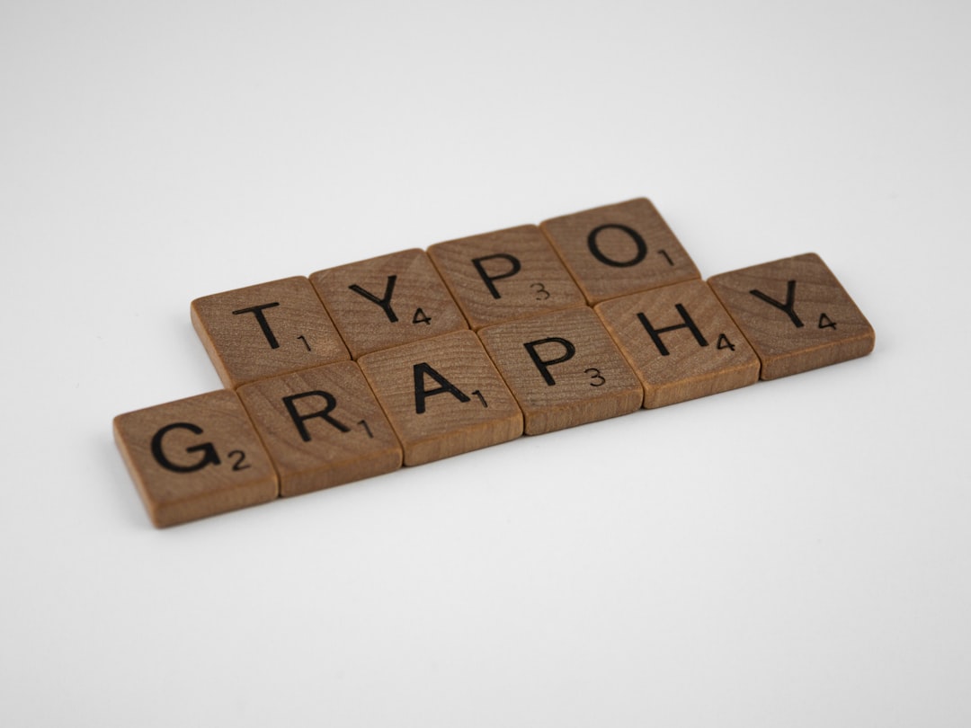
Introduction
In the rapidly evolving landscape of mobile application development, the visual identity of an application is paramount. While functionality drives user retention, the user interface (UI) and user experience (UX) are what initially captivate an audience. For developers following React Native News and Expo News, the trend is shifting heavily towards robust, type-safe design systems that ensure consistency across screens. One of the most powerful combinations for achieving this in modern development is leveraging NativeBase alongside Expo and TypeScript.
NativeBase has established itself as a cornerstone in the NativeBase News ecosystem, offering a utility-first library that simplifies building accessible and consistent UIs. However, a common hurdle developers face is breaking away from system defaults to implement a unique brand identity using custom typography. While Expo makes font loading straightforward, integrating these fonts deeply into the NativeBase theme engine—while maintaining strict TypeScript definitions—can be complex.
This article serves as a comprehensive guide to bridging the gap between design and implementation. We will explore how to seamlessly integrate Google Fonts into a React Native Expo project, configure the NativeBase theme to utilize these fonts, and, crucially, use TypeScript declaration merging to ensure your theme is fully typed. Whether you are migrating from React Native Elements News or starting a fresh project, this guide will elevate your frontend architecture.
Section 1: The Foundation – Setup and Font Loading Strategies
Before diving into the theming engine, it is essential to understand the underlying mechanics of font loading in the Expo ecosystem. Unlike standard web development where CSS handles font imports effortlessly, React Native requires asynchronous loading of font assets before the UI renders. If this process is not handled correctly, users may experience the dreaded “Flash of Unstyled Text” or application crashes.
In the context of React News and the broader ecosystem, Expo provides the expo-font library and the incredibly useful @expo-google-fonts packages. These packages allow us to import specific font weights and variants directly into our JavaScript bundle, ensuring they are available for the native layer.
Initializing the Project
To begin, we assume a standard Expo setup with TypeScript. The first step involves installing the necessary dependencies. We need the NativeBase core, its dependencies (like react-native-svg and react-native-safe-area-context), and the specific Google Font package we intend to use. For this example, we will use the popular “Inter” font family.
npm install native-base styled-components styled-system react-native-svg react-native-safe-area-context
npm install @expo-google-fonts/inter expo-font expo-app-loading
Asynchronous Font Loading
The entry point of your application (usually App.tsx) is responsible for loading these assets. We utilize the useFonts hook provided by the Expo Google Fonts package. It is critical to wrap your application in the NativeBaseProvider only after the fonts have successfully loaded. This ensures that any component requesting a specific font weight finds the asset ready.
Here is how to structure the entry point to handle asset loading gracefully:
import React from 'react';
import { NativeBaseProvider, Box, Text, Center } from 'native-base';
import {
  useFonts,
  Inter_400Regular,
  Inter_700Bold,
  Inter_900Black
} from '@expo-google-fonts/inter';
import * as SplashScreen from 'expo-splash-screen';
import { useCallback, useEffect } from 'react';
import { View } from 'react-native';

// Keep the splash screen visible while we fetch resources
SplashScreen.preventAutoHideAsync();

export default function App() {
  let [fontsLoaded] = useFonts({
    Inter_400Regular,
    Inter_700Bold,
    Inter_900Black,
  });

  const onLayoutRootView = useCallback(async () => {
    if (fontsLoaded) {
      // This tells the splash screen to hide immediately
      await SplashScreen.hideAsync();
    }
  }, [fontsLoaded]);

  if (!fontsLoaded) {
    return null;
  }

  return (
    <View style={{ flex: 1 }} onLayout={onLayoutRootView}>
      <NativeBaseProvider>
        <Center flex={1} bg="coolGray.100">
          <Box p="5" bg="white" shadow={2} rounded="lg">
            <Text fontFamily="Inter_900Black" fontSize="xl">
              NativeBase + Expo Fonts
            </Text>
            <Text fontFamily="Inter_400Regular" mt="2">
              This text is using the Inter Regular font.
            </Text>
          </Box>
        </Center>
      </NativeBaseProvider>
    </View>
  );
}
In this setup, we are manually specifying the fontFamily string (e.g., “Inter_900Black”). While functional, this is brittle. The goal of using NativeBase News techniques is to abstract these strings into semantic names like “body” or “heading” within the theme configuration.

Section 2: Configuring the Theme for Semantic Typography
NativeBase 3.0 introduced a powerful theming engine based on the System UI specification. This allows developers to define a dictionary of design tokens. Instead of hardcoding font names throughout your application, you map font families to semantic keys. This is a practice widely discussed in Tamagui News and React Native Paper News as well, but NativeBase makes the implementation particularly straightforward.
Creating the Theme Object
We need to create a dedicated theme file. This file will use extendTheme to overwrite the default NativeBase typography settings. We will map our loaded Google Fonts to the fontConfig and then assign those configurations to the fonts object.
The hierarchy works as follows:
- fontConfig: Defines the available font weights and styles for a specific font family.
- fonts: Maps semantic keys (heading, body, mono) to the keys defined in fontConfig.
Here is a robust implementation of a custom theme configuration:
// theme.ts
import { extendTheme } from 'native-base';

const theme = extendTheme({
  fontConfig: {
    Inter: {
      100: {
        normal: 'Inter_100Thin',
        italic: 'Inter_100Thin_Italic',
      },
      200: {
        normal: 'Inter_200ExtraLight',
        italic: 'Inter_200ExtraLight_Italic',
      },
      300: {
        normal: 'Inter_300Light',
        italic: 'Inter_300Light_Italic',
      },
      400: {
        normal: 'Inter_400Regular',
        italic: 'Inter_400Regular_Italic',
      },
      500: {
        normal: 'Inter_500Medium',
      },
      600: {
        normal: 'Inter_600SemiBold',
      },
      700: {
        normal: 'Inter_700Bold',
      },
      800: {
        normal: 'Inter_800ExtraBold',
      },
      900: {
        normal: 'Inter_900Black',
      },
    },
  },
  // Map the fontConfig to semantic names
  fonts: {
    heading: 'Inter',
    body: 'Inter',
    mono: 'Inter',
  },
  // Update component default styles to use these fonts
  components: {
    Heading: {
      baseStyle: {
        fontFamily: 'heading',
        fontWeight: '700',
      },
    },
    Text: {
      baseStyle: {
        fontFamily: 'body',
        fontWeight: '400',
      },
    },
  },
});

export default theme;
By injecting this theme into the NativeBaseProvider, you can now use <Text> and <Heading> components without ever manually specifying a font family. NativeBase handles the resolution automatically. This level of abstraction is what separates a prototype from a production-grade application, a topic frequently highlighted in React Native Elements News and Storybook News.
Section 3: Advanced TypeScript Integration and Type Safety
One of the most critical aspects of modern React development, whether you are following Next.js News or React Native News, is TypeScript integration. A common pain point when customizing themes in libraries like NativeBase, Material UI, or Chakra UI is that the TypeScript compiler is unaware of your custom tokens. If you try to access a custom color or font variant, TypeScript might throw an error or fail to provide autocomplete suggestions.
To solve this, we utilize Declaration Merging. This allows us to extend the default type definitions provided by NativeBase to include our custom theme structure. This ensures that when a developer types fontFamily=, their IDE suggests “Inter” or “body” rather than generic strings.
Implementing Declaration Merging
You need to create a declaration file (usually named nativebase.d.ts) in your source root. This file tells TypeScript that the CustomThemeType we created matches the internal ICustomTheme interface expected by NativeBase.
// nativebase.d.ts
import { INativebaseConfig } from 'native-base';
import { CustomThemeType } from './src/theme'; // Import the type of your theme

declare module 'native-base' {
  interface ICustomTheme extends CustomThemeType {}
}
To make this work effectively, you must export the type of your theme in your theme.ts file. Here is how you modify the previous theme file to support this:
// theme.ts updates
import { extendTheme } from 'native-base';

const theme = extendTheme({
  // ... previous configuration
  colors: {
    brand: {
      900: '#1a365d',
      800: '#153e75',
      700: '#2a69ac',
    },
  },
});

// Get the type of the custom theme
type CustomThemeType = typeof theme;

// Export the theme and the type
export { CustomThemeType };
export default theme;
Using Typed Components
Once the declaration merging is set up, the developer experience improves drastically. When using hooks like useTheme, TypeScript will know exactly what your theme structure looks like.
import React from 'react';
import { Box, Text, useTheme, Button } from 'native-base';

const UserProfile = () => {
  const theme = useTheme();

  // TypeScript knows 'brand.900' exists because of our declaration file
  const primaryColor = theme.colors.brand[900];

  return (
    <Box bg="white" p="4">
      {/* The fontWeight prop will now autocomplete based on the Inter font config */}
      <Text fontFamily="body" fontWeight="600" color="brand.700">
        User Profile
      </Text>

      <Button
        mt="4"
        colorScheme="brand"
        _text={{ fontFamily: 'heading', fontWeight: '700' }}
      >
        Edit Profile
      </Button>
    </Box>
  );
};

export default UserProfile;
This approach aligns with best practices seen in React Testing Library News and Jest News, as strongly typed themes make testing easier by reducing magic strings and ensuring that style tokens are consistent across the test suite.
Section 4: Best Practices, Performance, and Ecosystem Comparisons
While NativeBase provides a robust solution, it is vital to keep an eye on performance and the broader ecosystem. Following React Native Reanimated News and FlashList News reveals that performance is a constant battle in mobile development. Here are key considerations when using custom fonts and NativeBase.
1. Font Subsetting and Loading
Do not load every single font weight available in Google Fonts. If your design only uses Regular (400), SemiBold (600), and Bold (700), only import those. Loading unused font binaries increases the bundle size and the time it takes for the application to become interactive. This is a principle often discussed in Next.js News regarding Web Vitals, but it applies equally to the startup time of React Native apps.
2. Responsive Typography
NativeBase excels at responsive design. You can define font sizes in arrays or objects to handle different device sizes (e.g., phones vs. tablets). This is similar to the approach taken in Tailwind CSS.
<Text fontSize={{ base: 'md', md: 'lg', lg: 'xl' }}>
  Responsive Text
</Text>
3. Ecosystem Alternatives
It is worth noting how this compares to other libraries. Tamagui News often highlights its “zero-runtime” compiler, which can offer better performance than NativeBase’s runtime style calculation. However, NativeBase’s API is generally considered more accessible for beginners. React Native Paper News focuses heavily on Material Design, which is great if you want that specific look, but NativeBase offers more flexibility for custom design systems. Meanwhile, Restyle (by Shopify) offers extreme type safety but with a steeper learning curve.
4. Accessibility
Always ensure that your custom fonts scale correctly with the user’s system accessibility settings. NativeBase’s Text component handles this by default, but be wary of setting fixed heights on containers that hold text. Tools like Detox News and Cypress News (for web) are excellent for automated testing of these accessibility features.
Conclusion
Integrating custom Google Fonts with NativeBase, Expo, and TypeScript transforms a generic React Native application into a polished, branded experience. By moving beyond simple font loading and embracing the full power of the NativeBase theming engine, developers can create a centralized source of truth for typography.
The combination of Expo’s asset management, NativeBase’s utility props, and TypeScript’s safety mechanisms creates a developer experience that is both efficient and scalable. As you continue to follow React Native News, you will find that these foundational skills in design system architecture are transferable across various frameworks, from Remix News to Gatsby News.
Start by auditing your current project’s typography. Are you using hardcoded font strings? Are your font weights consistent? Implement the strategies outlined in this article to refactor your codebase into a maintainable, type-safe masterpiece. The initial investment in setting up the theme and TypeScript definitions will pay dividends in development speed and UI consistency for the lifecycle of your application.


