In the competitive landscape of mobile applications, user experience (UX) is the ultimate differentiator. A seamless, intuitive, and aesthetically pleasing interface can significantly impact user engagement and retention. One of the most fundamental components of a great mobile UX is navigation. Among the various patterns, the bottom tab navigator stands out as a universally recognized and efficient way for users to switch between the main sections of an app. For developers in the React ecosystem, combining the power of React Navigation with a robust UI library is key to building these experiences efficiently.
This is where React Native Paper shines. As a comprehensive and production-ready component library for React Native, it brings Google’s Material Design system to your fingertips. When paired with React Navigation, it allows for the creation of beautiful, highly customizable, and performant bottom tab navigators that feel native to the platform. This article provides a deep dive into this powerful combination. We’ll go from initial setup to building a fully functional and dynamic bottom tab navigator, covering advanced theming, dynamic badges, and essential best practices. Whether you’re following the latest React Native News or are a seasoned developer, this guide will equip you with the skills to elevate your app’s navigation.
Setting the Stage: Integrating React Navigation with React Native Paper
Before we can build our navigation, we need to lay the proper foundation by setting up our project with the necessary libraries. The synergy between React Navigation and React Native Paper is what makes this combination so effective. React Navigation handles the core routing logic, state management, and history stack, while React Native Paper provides the polished, themeable UI components that bring our navigator to life.
Why This Combination?
While React Navigation provides its own default UI for navigators, integrating a dedicated component library like React Native Paper offers several advantages. You get access to a consistent set of Material Design components that follow best practices for accessibility and platform adaptation. This is a significant step up from building custom components from scratch and ensures a cohesive look and feel across your entire application. While other libraries like NativeBase News or the more recent Tamagui News offer excellent cross-platform styling solutions, React Native Paper’s focus on Material Design makes it a go-to choice for many developers.
Initial Project Setup
First, ensure you have a React Native project ready. Using a framework like Expo can streamline this process, which is always welcome Expo News for developers looking to get started quickly. Next, you’ll need to install the core dependencies:
# Using npm
npm install @react-navigation/native react-native-paper @react-navigation/material-bottom-tabs react-native-vector-icons react-native-safe-area-context

# Using yarn
yarn add @react-navigation/native react-native-paper @react-navigation/material-bottom-tabs react-native-vector-icons react-native-safe-area-context
The key packages here are @react-navigation/native for the core navigation logic and @react-navigation/material-bottom-tabs, which is the specific navigator that is built to integrate seamlessly with React Native Paper. react-native-vector-icons is a peer dependency required for displaying icons in the tabs.
Configuring the Providers
Both libraries require a “Provider” component to be wrapped around the root of your application. The NavigationContainer manages the navigation tree and state, while the PaperProvider injects the theme and other settings for the UI components. Your main App.js or App.tsx file should be structured to include both.
import React from 'react';
import { NavigationContainer } from '@react-navigation/native';
import { Provider as PaperProvider } from 'react-native-paper';
import MainNavigator from './navigation/MainNavigator'; // We will create this next

export default function App() {
  return (
    <PaperProvider>
      <NavigationContainer>
        <MainNavigator />
      </NavigationContainer>
    </PaperProvider>
  );
}
This setup ensures that all components within your app have access to both the navigation context and the React Native Paper theme, which is crucial for the next steps.
From Zero to Hero: Implementing a Basic Bottom Tab Navigator
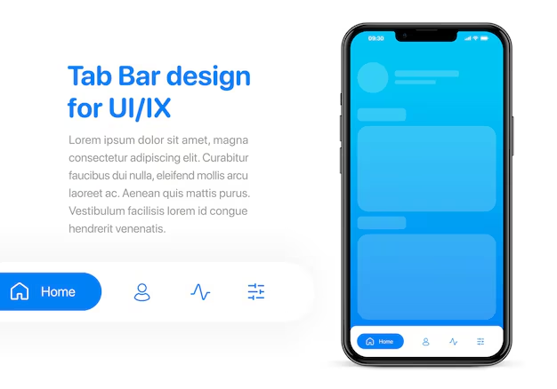
With the project configured, we can now create our first bottom tab navigator. The process is straightforward and involves defining our screens and then assembling them within the navigator component provided by @react-navigation/material-bottom-tabs.
Defining Screens and the Navigator
First, let’s create a few placeholder screens that our navigator will display. These can be simple components for now.
// screens/HomeScreen.js
import React from 'react';
import { View, Text } from 'react-native';
import { Appbar } from 'react-native-paper';

export const HomeScreen = () => (
  <>
    <Appbar.Header>
      <Appbar.Content title="Home" />
    </Appbar.Header>
    <View style={{ flex: 1, justifyContent: 'center', alignItems: 'center' }}>
      <Text>Home Screen</Text>
    </View>
  </>
);

// screens/ProfileScreen.js
import React from 'react';
import { View, Text } from 'react-native';
import { Appbar } from 'react-native-paper';

export const ProfileScreen = () => (
  <>
    <Appbar.Header>
      <Appbar.Content title="Profile" />
    </Appbar.Header>
    <View style={{ flex: 1, justifyContent: 'center', alignItems: 'center' }}>
      <Text>Profile Screen</Text>
    </View>
  </>
);

// screens/SettingsScreen.js
import React from 'react';
import { View, Text } from 'react-native';
import { Appbar } from 'react-native-paper';

export const SettingsScreen = () => (
  <>
    <Appbar.Header>
      <Appbar.Content title="Settings" />
    </Appbar.Header>
    <View style={{ flex: 1, justifyContent: 'center', alignItems: 'center' }}>
      <Text>Settings Screen</Text>
    </View>
  </>
);
Now, let’s create the navigator itself. We’ll use the createMaterialBottomTabNavigator function and configure each tab with a name, a component, and an icon.
// navigation/MainNavigator.js
import React from 'react';
import { createMaterialBottomTabNavigator } from '@react-navigation/material-bottom-tabs';
import MaterialCommunityIcons from 'react-native-vector-icons/MaterialCommunityIcons';
import { HomeScreen, ProfileScreen, SettingsScreen } from '../screens';

const Tab = createMaterialBottomTabNavigator();

function MainNavigator() {
  return (
    <Tab.Navigator
      initialRouteName="Home"
      activeColor="#e91e63"
      labelStyle={{ fontSize: 12 }}
      style={{ backgroundColor: 'tomato' }}
    >
      <Tab.Screen
        name="Home"
        component={HomeScreen}
        options={{
          tabBarLabel: 'Home',
          tabBarIcon: ({ color }) => (
            <MaterialCommunityIcons name="home" color={color} size={26} />
          ),
        }}
      />
      <Tab.Screen
        name="Profile"
        component={ProfileScreen}
        options={{
          tabBarLabel: 'Profile',
          tabBarIcon: ({ color }) => (
            <MaterialCommunityIcons name="account" color={color} size={26} />
          ),
        }}
      />
      <Tab.Screen
        name="Settings"
        component={SettingsScreen}
        options={{
          tabBarLabel: 'Settings',
          tabBarIcon: ({ color }) => (
            <MaterialCommunityIcons name="cog" color={color} size={26} />
          ),
        }}
      />
    </Tab.Navigator>
  );
}

export default MainNavigator;
In this example, we define three tabs. The tabBarIcon option is a function that receives properties like color and focused, allowing you to render different icons or styles for the active tab. This declarative approach is a core strength of React Navigation and is a recurring theme in recent React Navigation News.
Beyond the Basics: Advanced Theming and Dynamic Tabs
A static navigator is good, but real-world applications require more dynamism and brand consistency. This is where we can leverage the full power of React Native Paper’s theming system and React’s state management capabilities.
Deep Theming with React Native Paper
React Native Paper’s components, including the material bottom tab navigator, are designed to work with a central theme object. You can override the default theme or create a new one to match your brand’s color palette, fonts, and component styles. This theme is then passed to the PaperProvider at the root of your app.
// App.js
import React from 'react';
import { NavigationContainer } from '@react-navigation/native';
import { Provider as PaperProvider, DefaultTheme } from 'react-native-paper';
import MainNavigator from './navigation/MainNavigator';

const theme = {
  ...DefaultTheme,
  colors: {
    ...DefaultTheme.colors,
    primary: '#6200ee',
    accent: '#03dac4',
    background: '#f6f6f6',
    surface: '#ffffff',
    text: '#000000',
  },
};

export default function App() {
  return (
    <PaperProvider theme={theme}>
      <NavigationContainer>
        <MainNavigator />
      </NavigationContainer>
    </PaperProvider>
  );
}
By defining this custom theme, the bottom tab navigator will automatically pick up the new primary and accent colors for its active indicator and icons, ensuring visual consistency without needing to manually style every component.
Adding Badges for Notifications
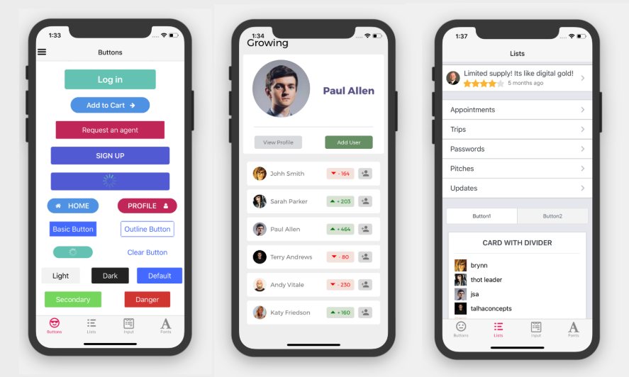
A common UX pattern is to display a badge on a tab icon to indicate new content, such as unread messages or notifications. The material bottom tab navigator supports this out-of-the-box with the tabBarBadge option. This can be a boolean (for a simple dot) or a number/string. You can connect this to your app’s state, whether it’s managed by component state, React Context, or a global state library. The latest Zustand News and Redux News highlight lightweight approaches to managing such global state efficiently.
Here’s how you might use component state to show a badge:
// Inside a screen component that can update state
const [notificationCount, setNotificationCount] = useState(3);

// In your MainNavigator.js
<Tab.Screen
  name="Profile"
  component={ProfileScreen}
  options={{
    tabBarLabel: 'Profile',
    tabBarIcon: ({ color }) => (
      <MaterialCommunityIcons name="account" color={color} size={26} />
    ),
    tabBarBadge: notificationCount > 0 ? notificationCount : null,
  }}
/>
In a real application, notificationCount would likely come from a global store or a data-fetching library. The latest React Query News and Apollo Client News showcase powerful hooks for managing server state, which could be used to fetch notification counts and automatically update the UI.
Production-Ready: Best Practices and Optimization
Building a functional navigator is one thing; ensuring it’s performant, maintainable, and well-tested is another. Following best practices is crucial for long-term project health.
Performance Considerations
By default, all screens in the material bottom tab navigator are rendered and mounted simultaneously to ensure a smooth swiping experience. For screens with heavy computations or large data loads, this can impact initial app load time. To mitigate this, you can use the unmountOnBlur option on a per-screen basis:
<Tab.Screen
  name="Analytics"
  component={AnalyticsScreen}
  options={{
    unmountOnBlur: true,
    // ... other options
  }}
/>
Setting unmountOnBlur: true will cause the screen to be unmounted when the user navigates away from it, freeing up memory. Use this judiciously, as it means the screen’s state will be lost and it will need to re-mount and re-fetch data when the user returns.
Code Organization
As your app grows, your navigation logic can become complex. It’s a good practice to centralize it. Create a dedicated /navigation directory in your project. Inside, you can have your root navigator (like MainNavigator.js) and potentially separate files for different stacks (e.g., HomeStack.js, ProfileStack.js). This keeps your App.js clean and makes the navigation structure easy to understand and modify.
Testing Your Navigation
Navigation is a critical user flow that should be thoroughly tested. You can test your navigation logic and screen rendering using tools from the React Native testing ecosystem. The latest React Testing Library News shows it’s a great tool for writing integration tests that ensure components within your navigator render correctly. For end-to-end (E2E) testing that simulates real user interactions, frameworks like Detox are invaluable. The latest Detox News emphasizes its power in testing native features and complex navigation flows on actual devices or simulators, giving you confidence that your tabs, stacks, and drawers work as expected before shipping to production.
Conclusion
We’ve journeyed from a blank slate to a fully functional, themed, and dynamic bottom tab navigator using the powerful combination of React Native Paper and React Navigation. This pairing provides a best-in-class developer experience for creating Material Design-compliant mobile apps with intuitive navigation. By leveraging React Native Paper’s components, you get beautiful, accessible, and performant UI elements out of the box, while React Navigation handles the complex routing logic with a simple, declarative API.
The key takeaways are clear: start with a solid foundation by correctly setting up the providers, build your navigator declaratively by defining screens and options, and leverage the deep theming capabilities of React Native Paper for brand consistency. Finally, don’t forget to implement dynamic features like badges and adhere to best practices for performance and testing to deliver a truly production-ready application. Your next step could be to explore nesting stack navigators within each tab or experimenting with other navigators like the Material Top Tab Navigator to further enhance your app’s UX.
