In the dynamic world of mobile app development, creating a user interface that is both aesthetically pleasing and functionally robust is a paramount challenge. Developers strive for a consistent look and feel across different platforms without sacrificing performance or development speed. This is where React Native shines, offering a single codebase for both iOS and Android. However, building a sophisticated UI from scratch can be a monumental task. This is where component libraries come into play, and among the top contenders, React Native Paper stands out as a premier choice for implementing Google’s Material Design system in React Native applications.
React Native Paper is a high-quality, production-ready library that provides a comprehensive set of customizable and accessible UI components. It meticulously follows Material Design guidelines, ensuring that your app feels modern, intuitive, and familiar to users. Whether you’re building a simple utility or a complex enterprise application, React Native Paper equips you with the tools to build beautiful interfaces efficiently. This article will serve as a comprehensive guide, diving deep into its core concepts, theming capabilities, advanced implementations, and best practices, providing you with actionable insights and practical code examples to elevate your mobile development workflow. This is a significant piece of React Native News for any developer looking to streamline their UI development process.
Getting Started: Core Concepts and Setup
Before you can leverage the power of React Native Paper, you need to integrate it into your project. The setup process is straightforward, whether you’re working with a bare React Native project or using the popular Expo framework. This initial setup lays the foundation for all the components and theming features the library offers.
Installation and Configuration
First, add the library to your project using npm or yarn:
# Using npm
npm install react-native-paper

# Using yarn
yarn add react-native-paper
React Native Paper relies on react-native-vector-icons for its extensive icon library. If you’re using a bare React Native project, you’ll need to install and link this package. Expo projects, fortunately, include this library by default, simplifying the setup. For bare projects, follow the installation instructions for react-native-vector-icons to ensure icons render correctly.
The PaperProvider and Basic Components
The heart of React Native Paper’s theming system is the PaperProvider. This component must wrap your application’s root. It uses React’s Context API to pass the theme down to every component in the tree, ensuring that all Paper components have access to your design system’s colors, fonts, and spacing. Without it, components will not render correctly.
Let’s build a simple login screen to see some basic components in action. We’ll use Card, TextInput, and Button to create a clean, functional UI with minimal effort. Notice how the components have a polished, Material Design look right out of the box.
import React from 'react';
import { SafeAreaView, StyleSheet } from 'react-native';
import {
  Provider as PaperProvider,
  Card,
  TextInput,
  Button,
  Title,
} from 'react-native-paper';

const App = () => {
  const [email, setEmail] = React.useState('');
  const [password, setPassword] = React.useState('');

  return (
    <PaperProvider>
      <SafeAreaView style={styles.container}>
        <Card style={styles.card}>
          <Card.Content>
            <Title style={styles.title}>Welcome Back!</Title>
            <TextInput
              label="Email"
              value={email}
              onChangeText={text => setEmail(text)}
              style={styles.input}
              mode="outlined"
              keyboardType="email-address"
              autoCapitalize="none"
            />
            <TextInput
              label="Password"
              value={password}
              onChangeText={text => setPassword(text)}
              style={styles.input}
              mode="outlined"
              secureTextEntry
            />
            <Button
              mode="contained"
              onPress={() => console.log('Login Pressed')}
              style={styles.button}
            >
              Login
            </Button>
          </Card.Content>
        </Card>
      </SafeAreaView>
    </PaperProvider>
  );
};

const styles = StyleSheet.create({
  container: {
    flex: 1,
    justifyContent: 'center',
    padding: 16,
    backgroundColor: '#f5f5f5',
  },
  card: {
    padding: 16,
  },
  title: {
    textAlign: 'center',
    marginBottom: 24,
  },
  input: {
    marginBottom: 16,
  },
  button: {
    marginTop: 8,
    paddingVertical: 8,
  },
});

export default App;
Theming and Customization: Making It Your Own
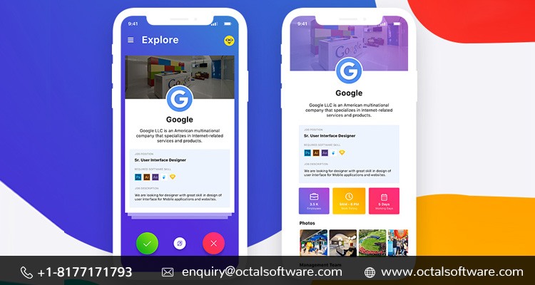
One of the most powerful features of React Native Paper is its comprehensive theming system. While the default Material Design theme is excellent, most applications require a unique brand identity. The library makes it incredibly easy to define a custom design language—including colors, fonts, and component styles—and apply it consistently across your entire app. This flexibility is a hot topic in the React Native Paper News community.
Defining a Custom Theme
You can create a custom theme by extending the DefaultTheme (for light mode) or MD3DarkTheme (for dark mode) provided by the library. The theme object allows you to override properties like colors, fonts, and roundness. The colors object is particularly important, as it defines the primary, accent, background, and surface colors that components will use automatically.
For more complex state management of themes, especially when allowing users to toggle between light and dark modes, integrating a state management library is a best practice. Libraries like Redux News, Zustand News, or Recoil News can help manage the theme state globally, making it accessible to your `PaperProvider` and any other part of your application that needs it.
import React from 'react';
import { Provider as PaperProvider, DefaultTheme, Button, Text } from 'react-native-paper';
import { View, StyleSheet } from 'react-native';

// 1. Define your custom theme by extending the default
const customTheme = {
  ...DefaultTheme,
  roundness: 8, // More rounded corners
  colors: {
    ...DefaultTheme.colors,
    primary: '#6200ee',
    accent: '#03dac4',
    background: '#f6f6f6',
    surface: '#ffffff',
    text: '#000000',
    placeholder: '#a0a0a0',
  },
};

const ThemedApp = () => {
  return (
    // 2. Pass the custom theme to the PaperProvider
    <PaperProvider theme={customTheme}>
      <View style={styles.container}>
        <Text style={styles.text}>This component uses the custom theme!</Text>
        <Button mode="contained" onPress={() => {}}>
          Primary Button
        </Button>
        <Button mode="outlined" style={{ marginTop: 10 }}>
          Outlined Button
        </Button>
      </View>
    </PaperProvider>
  );
};

const styles = StyleSheet.create({
  container: {
    flex: 1,
    justifyContent: 'center',
    alignItems: 'center',
    padding: 20,
  },
  text: {
    marginBottom: 20,
    fontSize: 16,
  },
});

export default ThemedApp;
Accessing Theme Properties with Hooks
Sometimes, you need to access theme values directly within your custom components to ensure they align with your design system. React Native Paper provides the useTheme hook for this exact purpose. This hook returns the full theme object, allowing you to pull out specific colors, fonts, or other properties to use in your `StyleSheet`.
This approach is far superior to hardcoding values, as it ensures that your custom components will automatically adapt if the theme ever changes, for example, when switching to dark mode. This dynamic styling capability is essential for building robust and maintainable applications.
Advanced Components and Navigation Integration
Beyond basic inputs and buttons, React Native Paper offers a rich collection of complex components for building sophisticated layouts and user flows. Components like Appbar, BottomNavigation, DataTable, and Dialog provide ready-made solutions for common UI patterns. A crucial aspect of building any mobile app is navigation, and integrating these components with a robust library like React Navigation News is a common and highly effective pattern.
Integrating with React Navigation
You can easily create a custom header for your screens using the Appbar component from React Native Paper. By passing a function to the header option in your stack navigator, you gain full control over the header’s appearance and functionality, allowing you to seamlessly match it with your app’s theme. This integration showcases how well different libraries in the modern React News ecosystem can work together.
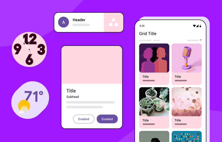
In the example below, we set up a simple two-screen app using React Navigation. We then replace the default navigator header with a custom one built from Appbar.Header, Appbar.BackAction, and Appbar.Content. This gives us a fully themed header that feels native to our application’s design system.
import React from 'react';
import { View, Text } from 'react-native';
import { NavigationContainer } from '@react-navigation/native';
import { createStackNavigator } from '@react-navigation/stack';
import { Provider as PaperProvider, Appbar, Button, DefaultTheme } from 'react-native-paper';

// Define a custom theme
const theme = {
  ...DefaultTheme,
  colors: {
    ...DefaultTheme.colors,
    primary: '#7B1FA2',
    accent: '#D1C4E9',
  },
};

function HomeScreen({ navigation }) {
  return (
    <View style={{ flex: 1, alignItems: 'center', justifyContent: 'center' }}>
      <Text>Home Screen</Text>
      <Button mode="contained" onPress={() => navigation.navigate('Details')}>
        Go to Details
      </Button>
    </View>
  );
}

function DetailsScreen() {
  return (
    <View style={{ flex: 1, alignItems: 'center', justifyContent: 'center' }}>
      <Text>Details Screen</Text>
    </View>
  );
}

const Stack = createStackNavigator();

function CustomNavigationBar({ navigation, back }) {
  return (
    <Appbar.Header>
      {back ? <Appbar.BackAction onPress={navigation.goBack} /> : null}
      <Appbar.Content title="My Awesome App" />
    </Appbar.Header>
  );
}

function App() {
  return (
    <PaperProvider theme={theme}>
      <NavigationContainer>
        <Stack.Navigator
          initialRouteName="Home"
          screenOptions={{
            header: (props) => <CustomNavigationBar {...props} />,
          }}
        >
          <Stack.Screen name="Home" component={HomeScreen} />
          <Stack.Screen name="Details" component={DetailsScreen} />
        </Stack.Navigator>
      </NavigationContainer>
    </PaperProvider>
  );
}

export default App;
Best Practices, Performance, and Ecosystem
To make the most of React Native Paper, it’s important to follow best practices that ensure your application is performant, maintainable, and scalable. This includes understanding how to optimize rendering, when to choose it over other libraries, and how it fits into the broader development ecosystem.
Performance and Optimization
React Native Paper is built with performance in mind, leveraging native components wherever possible through libraries like react-native-reanimated. However, developers should still be mindful of performance. When using the useTheme hook in deeply nested components, ensure that those components are memoized with React.memo if they are pure. This prevents unnecessary re-renders when the theme object changes but the specific values used by the component do not. For complex data displays, such as a DataTable populated from an API, using a data-fetching library like React Query News or Apollo Client News can help manage state, caching, and background updates efficiently.
Choosing the Right UI Library

The React Native ecosystem offers several excellent UI libraries. While React Native Paper excels at strict Material Design implementation, other libraries like NativeBase News and Tamagui News offer different philosophies. NativeBase is known for its high-level of abstraction and utility props, while Tamagui is a cutting-edge library focused on performance and universal (web and native) styling. The choice depends on your project’s needs: if your goal is a polished, consistent Material Design app with great theming and accessibility, React Native Paper is an industry-leading choice. For those building complex forms, integrating it with libraries like React Hook Form News or Formik News is a common and powerful pattern.
Testing and Development Workflow
A professional workflow involves robust testing. You can test your components using tools like React Testing Library News and Jest News to verify their behavior. For end-to-end testing, Detox News is a powerful framework that can simulate user interactions on a real device or simulator. Furthermore, using Storybook News to develop your UI components in isolation is a highly recommended practice. It allows you to build, view, and test each component with different props and states, ensuring they are robust before being integrated into the main application.
Conclusion
React Native Paper is more than just a component library; it’s a comprehensive toolkit for building high-quality, cross-platform mobile applications that adhere to the proven principles of Material Design. Its extensive set of components, powerful theming engine, and focus on accessibility provide a solid foundation for any project. By offering a clean, consistent, and developer-friendly API, it significantly accelerates the development process, allowing teams to focus on business logic rather than reinventing the UI wheel.
As we’ve seen, from basic setup to advanced navigation integration and theming, React Native Paper is both flexible and robust. By adopting the best practices discussed, you can build performant and maintainable applications that delight users. Whether you are a solo developer or part of a large team, integrating React Native Paper into your stack is a strategic decision that pays dividends in both development speed and final product quality. We encourage you to explore the official documentation and start incorporating this fantastic library into your next project.
