In the modern landscape of web and mobile development, data visualization is no longer a luxury but a core requirement for building intuitive and insightful applications. Users expect to see complex data presented in a clear, interactive, and visually appealing manner. For developers in the React ecosystem, the challenge lies in finding a library that is both powerful and flexible enough to meet these demands without introducing unnecessary complexity. This is where Victory, a composable charting library for React and React Native, truly shines.

Victory offers a unique, component-based approach to building charts. Instead of providing pre-packaged, monolithic chart components, it gives developers a set of primitive, modular building blocks that can be combined to create virtually any visualization imaginable. This philosophy empowers developers to craft bespoke, highly customized charts that perfectly match their application’s design and functionality. Whether you’re working on a dynamic dashboard in a Next.js News application, a data-rich report in a Gatsby News project, or a mobile analytics screen using React Native News, Victory provides the tools you need to succeed. This article serves as a comprehensive guide, exploring the latest Victory News, from core concepts to advanced techniques, helping you master this versatile library.
Understanding the Core Concepts of Victory
The fundamental principle behind Victory is composition. Think of it like building with LEGOs. Victory provides individual pieces—axes, bars, lines, labels—and you, the developer, assemble them inside a container to create a complete chart. This approach offers unparalleled flexibility compared to more rigid charting libraries. Let’s break down the essential components that form the foundation of any Victory chart.
The Building Blocks of a Chart
Every Victory visualization is built from a collection of modular components. Understanding their roles is the first step to mastering the library.
<VictoryChart>: This is the main container component. It’s responsible for coordinating all its children, normalizing data, and creating a shared scale and coordinate system. All other Victory components, like axes and data series, are typically rendered as children ofVictoryChart.<VictoryBar>,<VictoryLine>,<VictoryPie>, etc.: These are the data visualization components. They take an array of data and render it visually. You can mix and match these within a singleVictoryChartto create complex combination charts.<VictoryAxis>: This component renders the X and Y axes, including tick marks, tick labels, and an axis line. You can customize every aspect of its appearance and behavior.<VictoryLabel>: A highly versatile component for adding text annotations anywhere within your chart. It can be used for titles, data point labels, or custom annotations.- Container Components: Components like
<VictoryVoronoiContainer>or<VictoryZoomContainer>wrap your chart to add interactivity like tooltips, zooming, and panning.
To illustrate this, let’s build a simple bar chart. This example demonstrates how these components work together. You could easily integrate this into a project scaffolded with the latest Vite News tooling.
import React from 'react';
import { VictoryBar, VictoryChart, VictoryAxis, VictoryTheme } from 'victory';

const sampleData = [
  { quarter: 1, earnings: 13000 },
  { quarter: 2, earnings: 16500 },
  { quarter: 3, earnings: 14250 },
  { quarter: 4, earnings: 19000 }
];

const SimpleBarChart = () => {
  return (
    <VictoryChart
      // adding the material theme provided by Victory
      theme={VictoryTheme.material}
      domainPadding={20}
    >
      <VictoryAxis
        // tickValues specifies both the number of ticks and where they are placed
        tickValues={[1, 2, 3, 4]}
        tickFormat={["Quarter 1", "Quarter 2", "Quarter 3", "Quarter 4"]}
      />
      <VictoryAxis
        dependentAxis
        // tickFormat specifies how ticks should be displayed
        tickFormat={(x) => (`$${x / 1000}k`)}
      />
      <VictoryBar
        data={sampleData}
        // data accessors for x and y values
        x="quarter"
        y="earnings"
      />
    </VictoryChart>
  );
};

export default SimpleBarChart;
Implementation and Deep Customization
Victory’s true power is revealed through its extensive customization options, primarily handled via props. You can control everything from colors and fonts to data handling and event management. This granular control is essential when integrating charts into a cohesive UI, perhaps one built with component libraries like React Native Paper News or Tamagui News on mobile.
Styling and Data Handling
The most common customization involves styling. The style prop, available on most Victory components, allows you to apply CSS-like styles to different elements of the component. It accepts an object where keys correspond to specific parts of the component (e.g., data, labels, parent).
Data is typically passed as an array of objects to components like VictoryLine or VictoryBar. You then use the x and y props to specify which properties in your data objects correspond to the x and y axes. This data is often fetched from an API using a library like React Query News or Apollo Client News and managed in a global store with tools like Zustand News or the classic Redux News.
Let’s enhance our chart by creating a customized line chart that visualizes monthly user growth. This example showcases styling for the data line and labels.
import React from 'react';
import { VictoryChart, VictoryLine, VictoryAxis, VictoryLabel } from 'victory';

const userGrowthData = [
  { month: "Jan", users: 1200 },
  { month: "Feb", users: 1500 },
  { month: "Mar", users: 1400 },
  { month: "Apr", users: 1800 },
  { month: "May", users: 2200 },
  { month: "Jun", users: 2500 },
];

const CustomizedLineChart = () => {
  return (
    <VictoryChart width={600} height={400} >
      <VictoryLabel text="Monthly Active Users" x={300} y={30} textAnchor="middle" />
      <VictoryAxis
        style={{
          axis: { stroke: "#756f6a" },
          ticks: { stroke: "#756f6a", size: 5 },
          tickLabels: { fontSize: 12, padding: 5, fill: "#756f6a" }
        }}
      />
      <VictoryAxis
        dependentAxis
        tickFormat={(tick) => `${tick / 1000}k`}
        style={{
          axis: { stroke: "#756f6a" },
          grid: { stroke: ({ tick }) => tick > 1500 ? "red" : "grey", strokeDasharray: "4, 8" },
          tickLabels: { fontSize: 12, padding: 5, fill: "#756f6a" }
        }}
      />
      <VictoryLine
        data={userGrowthData}
        x="month"
        y="users"
        style={{
          data: { stroke: "#c43a31", strokeWidth: 3 },
          labels: { fontSize: 12, fill: "#c43a31" }
        }}
        labels={({ datum }) => datum.users}
        labelComponent={<VictoryLabel dy={-15} />}
      />
    </VictoryChart>
  );
};

export default CustomizedLineChart;
In this example, we’ve used the style prop to customize everything from the axis color to the grid lines, even making the grid line color conditional. We also added labels directly to the data points on the line, showcasing how data and presentation can be tightly integrated.
Advanced Techniques: Interactivity, Animations, and React Native
Static charts are useful, but interactive visualizations provide a much richer user experience. Victory excels at adding interactivity and animations with minimal effort. Furthermore, its cross-platform nature makes it a top choice for developers working with Expo News and React Native.
Events, Tooltips, and Animations
Victory’s event system is incredibly powerful. The events prop, available on most components, is an array of objects that defines which events to listen for (e.g., onClick, onMouseOver) and what mutations to apply to which components in response. This is commonly used to display tooltips or highlight data points.
The VictoryTooltip component is a first-class citizen for this purpose. It’s a label component that can be triggered by events to display information about a specific data point. For more complex interactions, you can use container components like VictoryVoronoiContainer, which improves the accuracy of tooltip triggering, especially for line charts.
Animations can be added declaratively via the animate prop. Victory can automatically tween between data and style changes, creating smooth transitions that bring your charts to life. While powerful animation libraries like React Spring News and Framer Motion News exist for complex UI animations, Victory’s built-in capabilities are often sufficient and much simpler for chart-specific animations.
Here is an example of an interactive pie chart with animations and tooltips that could be part of a dashboard in a Remix News or Blitz.js News application.
import React from 'react';
import { VictoryPie, VictoryTooltip } from 'victory';

const browserData = [
  { x: "Chrome", y: 68 },
  { x: "Safari", y: 19 },
  { x: "Firefox", y: 5 },
  { x: "Edge", y: 4 },
  { x: "Other", y: 4 },
];

const InteractivePieChart = () => {
  return (
    <VictoryPie
      data={browserData}
      colorScale={["#4285F4", "#7FADF4", "#FF9900", "#00A4EF", "#E8EAED"]}
      labelComponent={<VictoryTooltip cornerRadius={5} flyoutStyle={{ fill: "white" }} />}
      // Animate on load
      animate={{
        duration: 1000,
        onLoad: { duration: 500 }
      }}
      // Add events for interactivity
      events={[{
        target: "data",
        eventHandlers: {
          onMouseOver: () => {
            return [{
              target: "data",
              mutation: ({ style }) => {
                return style.fillOpacity === 0.7 ? null : { style: { ...style, fillOpacity: 0.7 } };
              }
            }, {
              target: "labels",
              mutation: () => ({ active: true })
            }];
          },
          onMouseOut: () => {
            return [{
              target: "data",
              mutation: () => {
                return null;
              }
            }, {
              target: "labels",
              mutation: () => ({ active: false })
            }];
          }
        }
      }]}
    />
  );
};

export default InteractivePieChart;
Using Victory in React Native
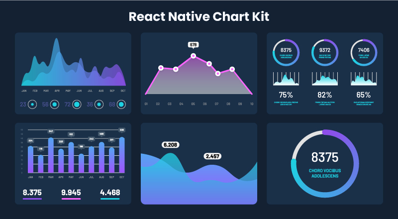
One of Victory’s standout features is its seamless support for React Native. Through the victory-native package, you can use the exact same component API to render charts on iOS and Android. It relies on react-native-svg as a peer dependency to render the SVG-based visualizations. This means you can share charting logic between your web app (built with, say, Razzle News) and your mobile app, which might be using a navigation library like React Navigation News. This write-once, render-anywhere capability is a massive productivity boost for cross-platform teams.
Best Practices, Optimization, and Testing
Building beautiful charts is one thing; ensuring they are performant, maintainable, and well-tested is another. Following best practices is crucial, especially in large-scale applications where performance is key.
Performance Considerations
- Memoization: Chart components can be expensive to re-render. Wrap your chart components in
React.memoto prevent unnecessary re-renders when props haven’t changed. This is especially important if the chart’s parent component updates frequently. - Large Datasets: For charts with thousands of data points, consider data downsampling or aggregation before passing the data to Victory. Rendering too many SVG nodes can slow down the browser.
- Container Components: Use specialized containers like
VictoryVoronoiContainerfor charts with many data points. It creates an invisible Voronoi mesh over the chart, making it much more performant to detect which data point is closest to the user’s cursor for triggering tooltips.
Testing Your Charts
Testing data visualizations can be tricky, but it’s essential for ensuring reliability. A combination of testing strategies is often most effective.
- Unit/Integration Testing: Use React Testing Library News with Jest News to write tests that assert your chart component renders correctly based on given props. You can check if the correct number of bars are rendered or if axes labels are displayed as expected. While you can’t easily test the exact visual output, you can verify the underlying SVG structure.
- Visual Regression Testing: Tools like Storybook’s snapshot testing or dedicated services can capture screenshots of your chart components and compare them against a baseline to catch unintended visual changes. This is a great way to maintain visual consistency.
- End-to-End Testing: For testing interactivity, frameworks like Cypress News or Playwright News (or Detox News for React Native) are invaluable. You can write scripts that simulate user actions like hovering over a data point and assert that a tooltip appears with the correct information.
When working with forms that control chart data, leveraging libraries like React Hook Form News or Formik News can streamline state management, and your tests should cover the integration between the form input and the resulting chart update.
import React from 'react';
import { render, screen } from '@testing-library/react';
import '@testing-library/jest-dom';
import SimpleBarChart from './SimpleBarChart'; // Assuming the component from the first example

describe('SimpleBarChart', () => {
  test('renders the correct number of bars', () => {
    render(<SimpleBarChart />);
    // Victory renders bars as `path` elements. We expect 4 bars.
    // The selector finds path elements that don't have a `role` of `presentation` (which are used for axes, etc.)
    const bars = container.querySelectorAll('path:not([role="presentation"])');
    expect(bars.length).toBe(4);
  });

  test('renders the correct axis labels', () => {
    render(<SimpleBarChart />);
    expect(screen.getByText('Quarter 1')).toBeInTheDocument();
    expect(screen.getByText('$16.5k')).toBeInTheDocument();
  });
});
Conclusion: Your Victory in Data Visualization
Victory stands out in the crowded field of charting libraries as a mature, flexible, and powerful tool for the modern React and React Native developer. Its composable architecture provides the ultimate freedom to build custom, interactive, and beautiful data visualizations that meet the precise needs of any project. By breaking down charts into fundamental building blocks, it encourages a declarative and reusable approach to visualization code. The latest Victory News continues to solidify its position as a go-to solution, especially with its excellent cross-platform support via victory-native.
By mastering its core concepts, leveraging its deep customization options, and implementing advanced features like interactivity and animation, you can elevate your applications and provide users with truly meaningful data insights. Whether you’re comparing it with alternatives like Recharts News or integrating it into a complex stack featuring RedwoodJS News and Urql News, Victory proves its value time and again. The next step is to explore the official documentation, experiment with different chart types, and start turning your data into compelling visual stories.