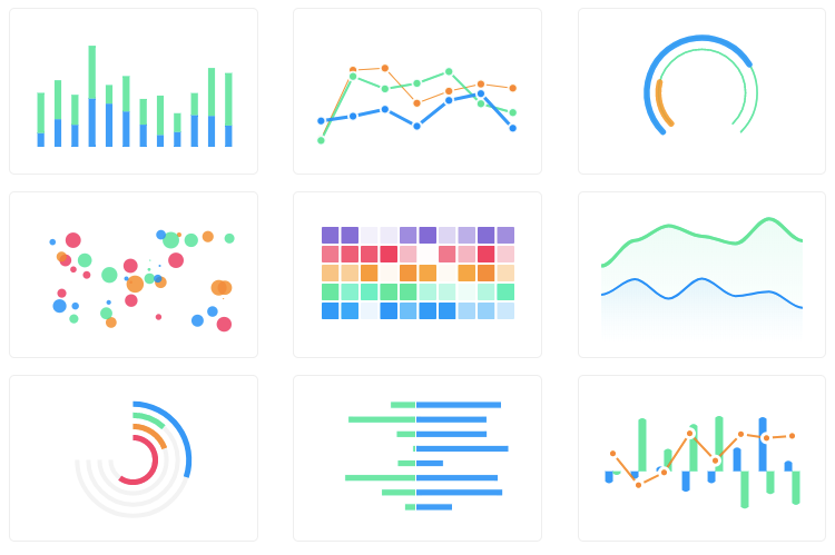
In the modern landscape of web development, data visualization is no longer a niche requirement but a core feature of many applications. From complex analytics dashboards to simple user-facing reports, the ability to present data in a clear, interactive, and visually appealing manner is crucial. For developers in the React ecosystem, this presents a unique challenge: finding a charting library that embraces React’s declarative and component-based paradigm. This is where Recharts shines. Built on top of React and the powerful D3.js library, Recharts provides a composable and intuitive API for building sophisticated charts with remarkable ease. It has become a go-to solution for developers using frameworks like Next.js, Remix, and Gatsby, offering a seamless way to integrate dynamic visualizations. This article provides a comprehensive deep dive into Recharts, exploring its core concepts, practical implementations, advanced techniques, and best practices for creating high-performance, responsive charts in your React applications.
Understanding the Core Philosophy of Recharts: Composability and Declarative Syntax
The fundamental power of Recharts lies in its adherence to React’s core principles. Instead of providing a monolithic chart object that you configure and manipulate imperatively, Recharts breaks down every chart into a set of individual, composable React components. This approach is a game-changer for developers accustomed to the React way of thinking. A complete chart is simply a tree of React components, each responsible for a specific part of the visualization.
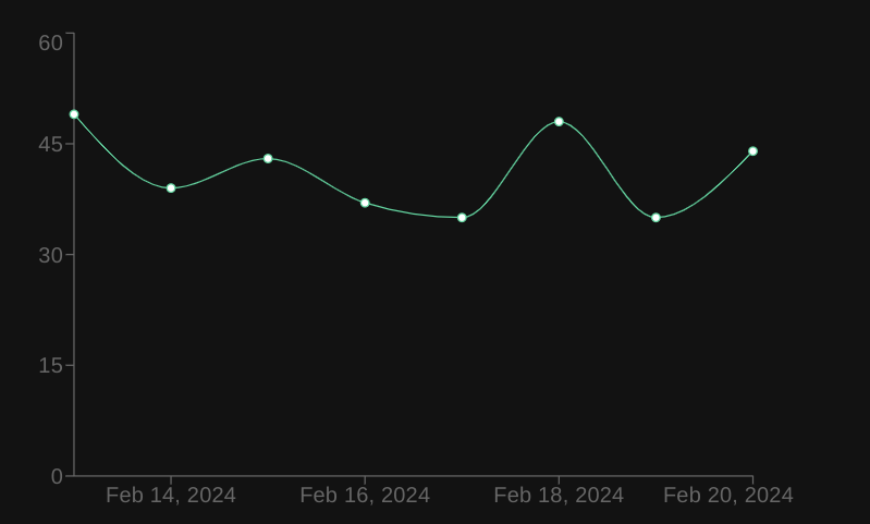
Consider the elements of a standard line chart: you have the lines themselves, an X-axis, a Y-axis, a grid for context, a tooltip for interactivity, and a legend. In Recharts, each of these is a distinct component: <LineChart>, <Line>, <XAxis>, <YAxis>, <CartesianGrid>, <Tooltip>, and <Legend>. You build a chart by simply composing these components together in your JSX, just as you would build any other part of your UI. This declarative syntax makes the code highly readable and easy to reason about. You can see the structure of your chart directly in your code, and customization is as simple as passing props to the relevant component. This composability is a key piece of Recharts News and what sets it apart from many older charting libraries.
Let’s look at a basic example of a simple line chart to illustrate this concept. This code can be used in any modern React setup, whether you’re using Vite, Create React App, or a full-stack framework covered in the latest Next.js News.
import React from 'react';
import { LineChart, Line, XAxis, YAxis, CartesianGrid, Tooltip, Legend, ResponsiveContainer } from 'recharts';

const data = [
  { name: 'Jan', uv: 4000, pv: 2400, amt: 2400 },
  { name: 'Feb', uv: 3000, pv: 1398, amt: 2210 },
  { name: 'Mar', uv: 2000, pv: 9800, amt: 2290 },
  { name: 'Apr', uv: 2780, pv: 3908, amt: 2000 },
  { name: 'May', uv: 1890, pv: 4800, amt: 2181 },
  { name: 'Jun', uv: 2390, pv: 3800, amt: 2500 },
  { name: 'Jul', uv: 3490, pv: 4300, amt: 2100 },
];

const SimpleLineChart = () => {
  return (
    <ResponsiveContainer width="100%" height={400}>
      <LineChart
        data={data}
        margin={{
          top: 5,
          right: 30,
          left: 20,
          bottom: 5,
        }}
      >
        <CartesianGrid strokeDasharray="3 3" />
        <XAxis dataKey="name" />
        <YAxis />
        <Tooltip />
        <Legend />
        <Line type="monotone" dataKey="pv" stroke="#8884d8" activeDot={{ r: 8 }} />
        <Line type="monotone" dataKey="uv" stroke="#82ca9d" />
      </LineChart>
    </ResponsiveContainer>
  );
};

export default SimpleLineChart;
In this example, each component declaratively defines a piece of the chart. The <LineChart> component acts as the main wrapper, receiving the data array. Inside, <CartesianGrid> draws the background grid, <XAxis> and <YAxis> render the axes (with dataKey="name" telling the X-axis which property to use for labels), and each <Line> component is responsible for rendering a line based on a specific dataKey from our data objects.
Practical Implementation: Building an Interactive Bar Chart
Moving beyond a simple example, let’s build a more practical, interactive bar chart. This is a common requirement for business dashboards and analytics platforms. We’ll include customized tooltips and a legend, demonstrating how props can be used to tailor the chart’s appearance and behavior. This kind of component could be a central piece of a data-driven application built with a framework like Remix or Blitz.js. The state for this data could easily come from a global state manager like Redux or Zustand, with updates from a data-fetching library like React Query or Apollo Client.
Setting Up the Data and Chart Structure

First, we define our dataset. Each object in the array represents a category on the x-axis, and the properties within each object represent the different bars for that category. The <BarChart> component will serve as our container. We’ll use the <Bar> component to define each series of bars, assigning a unique dataKey and fill color to each.
Interactivity is enabled by default with the <Tooltip> component. When a user hovers over a bar group, the tooltip will appear, displaying the data for that point. The <Legend> component automatically generates labels based on the name prop of each <Bar>, making the chart self-explanatory.
import React from 'react';
import { BarChart, Bar, XAxis, YAxis, CartesianGrid, Tooltip, Legend, ResponsiveContainer } from 'recharts';

const salesData = [
  { month: 'Jan', revenue: 1200, expenses: 800 },
  { month: 'Feb', revenue: 1500, expenses: 950 },
  { month: 'Mar', revenue: 1800, expenses: 1100 },
  { month: 'Apr', revenue: 1600, expenses: 1200 },
  { month: 'May', revenue: 2100, expenses: 1300 },
  { month: 'Jun', revenue: 2500, expenses: 1450 },
];

const InteractiveBarChart = () => {
  return (
    <ResponsiveContainer width="100%" height={400}>
      <BarChart
        data={salesData}
        margin={{ top: 20, right: 30, left: 20, bottom: 5 }}
      >
        <CartesianGrid strokeDasharray="3 3" />
        <XAxis dataKey="month" />
        <YAxis label={{ value: 'Amount ($)', angle: -90, position: 'insideLeft' }} />
        <Tooltip
          cursor={{ fill: 'rgba(206, 206, 206, 0.2)' }}
          formatter={(value, name) => [`$${value}`, name.charAt(0).toUpperCase() + name.slice(1)]}
        />
        <Legend />
        <Bar dataKey="revenue" fill="#8884d8" name="Revenue" />
        <Bar dataKey="expenses" fill="#82ca9d" name="Expenses" />
      </BarChart>
    </ResponsiveContainer>
  );
};

export default InteractiveBarChart;
In this code, we’ve added a few customizations. The <YAxis> has a label prop to add context. The <Tooltip> is customized with a cursor style to highlight the hovered bar group and a formatter function to format the displayed values with a dollar sign. This level of granular control via props is a hallmark of Recharts and makes it incredibly flexible.
Advanced Techniques: Custom Components and Synchronization
While the default components cover most use cases, Recharts’ true power is unlocked when you start creating custom components. This is especially useful for matching a specific design system or displaying complex, multi-faceted data within a tooltip. Furthermore, Recharts provides mechanisms for synchronizing multiple charts, a powerful feature for comparative analysis dashboards.
Creating a Custom Tooltip
The default tooltip is functional, but often you need more control over its appearance and content. Recharts allows you to pass a custom React component to the content prop of the <Tooltip> component. This custom component receives props like active (a boolean indicating if the tooltip should be shown) and payload (an array containing the data for the hovered point). This is a perfect example of how Recharts integrates seamlessly with the rest of your React application, allowing you to use your existing styling solutions or component libraries like React Native Paper or NativeBase in a React Native context (with react-native-svg).
import React from 'react';
import { BarChart, Bar, XAxis, YAxis, Tooltip, ResponsiveContainer } from 'recharts';

// Sample data
const data = [
  { name: 'Product A', sales: 400, profit: 240 },
  { name: 'Product B', sales: 300, profit: 139 },
  { name: 'Product C', sales: 200, profit: 980 },
];

// Custom Tooltip Component
const CustomTooltip = ({ active, payload, label }) => {
  if (active && payload && payload.length) {
    const profitPercentage = ((payload[1].value / payload[0].value) * 100).toFixed(2);
    return (
      <div className="custom-tooltip" style={{ backgroundColor: '#fff', border: '1px solid #ccc', padding: '10px' }}>
        <p className="label">{`${label}`}</p>
        <p style={{ color: payload[0].color }}>{`Sales: $${payload[0].value}`}</p>
        <p style={{ color: payload[1].color }}>{`Profit: $${payload[1].value}`}</p>
        <p className="intro">{`Profit Margin: ${profitPercentage}%`}</p>
      </div>
    );
  }
  return null;
};

const ChartWithCustomTooltip = () => {
  return (
    <ResponsiveContainer width="100%" height={300}>
      <BarChart data={data}>
        <XAxis dataKey="name" />
        <YAxis />
        <Tooltip content={<CustomTooltip />} />
        <Bar dataKey="sales" fill="#8884d8" />
        <Bar dataKey="profit" fill="#82ca9d" />
      </BarChart>
    </ResponsiveContainer>
  );
};

export default ChartWithCustomTooltip;
Synchronized Charts
For more advanced dashboards, you might need to display two different charts that share the same dataset or x-axis. Recharts makes this incredibly simple with the syncId prop. By assigning the same syncId to multiple charts (e.g., a <LineChart> and a <BarChart>), their tooltips and other interactive elements will be synchronized. Hovering over a point on one chart will trigger the corresponding tooltip on the other, providing a cohesive and powerful analytical experience for the user. This feature is invaluable for building complex financial or scientific dashboards.
Best Practices, Performance, and the Ecosystem

To get the most out of Recharts, it’s important to follow best practices, especially concerning performance and integration with the broader React ecosystem. The latest React News often focuses on performance, and charting libraries are a key area where optimizations can have a significant impact.
Performance Optimization
While Recharts is performant for most common use cases, rendering charts with thousands of data points can become a bottleneck. A primary cause of performance issues is unnecessary re-renders. If the data array passed to a chart is re-created on every render (e.g., by being defined inside the component body), React’s reconciliation will trigger a full re-render of the chart.
Best Practice: Always memoize your data and complex prop objects using React.useMemo. This ensures that the chart component only re-renders when the data has actually changed.
import React, { useMemo, useState } from 'react';
import { LineChart, Line } from 'recharts';

// Assume rawData comes from state or props
const MyOptimizedChart = ({ rawData }) => {
  const chartData = useMemo(() => {
    // Perform any expensive transformations here
    return rawData.map(item => ({ ...item, transformedValue: item.value * 2 }));
  }, [rawData]); // Dependency array ensures this only runs when rawData changes

  return (
    <LineChart width={500} height={300} data={chartData}>
      <Line type="monotone" dataKey="transformedValue" stroke="#8884d8" />
    </LineChart>
  );
};
Integration and Testing

Recharts components are, at their core, just React components. This means they can be tested using standard tools like React Testing Library and Jest. You can write tests to assert that axes are rendered with the correct labels, that the correct number of bars or line points are present, and that custom tooltips display the correct information. For visual regression testing and developing charts in isolation, integrating with Storybook is an excellent practice. This allows you to build out your chart library and view all its states without needing to run the entire application. When it comes to mobile, the latest React Native News confirms that libraries like Recharts, paired with react-native-svg, provide a solid foundation for cross-platform data visualization, a significant advantage over many web-only charting solutions like Victory charts.
Common Pitfalls to Avoid
1. Forgetting <ResponsiveContainer>: A common mistake is to set fixed widths and heights, leading to charts that break on different screen sizes. Always wrap your charts in <ResponsiveContainer> for a fluid layout.
2. In-line Object/Array Props: Avoid passing objects or arrays directly in props, like margin={{ top: 5 }}. This creates a new object on every render, which can break memoization. Define these objects outside the render cycle or memoize them.
3. Over-reliance on D3 for Customization: While Recharts uses D3 under the hood, its power comes from the React component model. Try to achieve customizations through props and custom React components before attempting to dive into the underlying D3 implementation, which can lead to complex and brittle code.
Conclusion: Why Recharts Remains a Top Choice
Recharts has firmly established itself as a leading charting library in the React ecosystem for good reason. Its component-based, declarative API aligns perfectly with the mental model of a React developer, making chart creation feel natural and intuitive. The library strikes an excellent balance between simplicity for common use cases and extensibility for advanced, custom visualizations. By offering built-in interactivity, responsiveness, and a composable architecture, it empowers developers to build beautiful, high-performance charts with minimal friction. Whether you are building a dashboard in a Next.js application, a reporting tool in Remix, or a mobile app with React Native, Recharts provides a robust and reliable foundation for all your data visualization needs. As the React ecosystem continues to evolve, the principles of composability and declarative UI that Recharts champions will ensure it remains a relevant and powerful tool for years to come.


