The Next Chapter in Mobile UI: Embracing Material You with React Native Paper 5.0
The world of mobile application development is in a constant state of flux, with user experience (UX) at the heart of every successful app. In the React Native ecosystem, developers are continually seeking tools that not only streamline development but also deliver a polished, modern, and intuitive interface. The latest React Native News centers on a significant leap forward in this domain: the release of React Native Paper 5.0. This isn’t just an incremental update; it’s a paradigm shift that fully embraces Google’s Material Design 3, famously known as “Material You.”
This major version introduces a host of changes, from dynamic, wallpaper-based theming to a suite of new and redesigned components. For developers, this means the power to create apps that feel deeply personal and seamlessly integrated with the user’s device. This article provides a comprehensive technical guide to React Native Paper 5.0. We’ll explore the core concepts of Material You, walk through practical implementation with code examples, uncover advanced techniques, and discuss best practices for migrating and optimizing your applications. This update is a cornerstone of recent Expo News and will influence how we build interfaces for the foreseeable future.
From Static to Dynamic: Understanding the Core of Material Design 3
The most transformative feature of React Native Paper 5.0 is its wholehearted adoption of Material Design 3 (MD3). This new design language moves beyond the static, developer-defined color palettes of its predecessor and into a world of dynamic, user-centric personalization. Understanding these principles is key to leveraging the library’s full potential.
Key Principles of Material You (MD3)
Material You is built on a foundation of expressiveness and adaptability. Its core tenets directly influence the components and theming capabilities now available in React Native Paper.
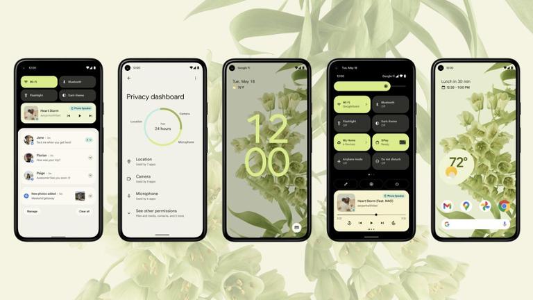
- Dynamic Color: This is the star of the show. MD3 can algorithmically extract a rich color palette from a user’s wallpaper. These colors are then applied throughout the app’s UI, including buttons, backgrounds, and accents, creating a cohesive and deeply personal experience.
- Harmonious Tones: Instead of a single primary and secondary color, MD3 generates tonal palettes. These are sets of colors with varying levels of luminance, ensuring accessible contrast and providing a sophisticated visual hierarchy. For example, a “Primary Container” will be a softer tone of the main “Primary” color.
- Updated Components and Shapes: MD3 refreshes the look and feel of common UI elements. You’ll notice more rounded corners on components like cards and buttons, a redesigned floating action button (FAB) that’s now a rounded square, and updated typography scales for improved readability.
Implementing a Basic MD3 Theme
Getting started with the new MD3 theme is straightforward. React Native Paper 5.0 ships with default light and dark themes that you can use out of the box. The primary change is swapping the old `DefaultTheme` for the new `MD3LightTheme` or `MD3DarkTheme`.
Here’s how you would set up the `PaperProvider` in your root component, such as `App.tsx`:
import * as React from 'react';
import {
  MD3LightTheme,
  Provider as PaperProvider,
} from 'react-native-paper';
import { AppContent } from './AppContent'; // Your main app component

// Define your MD3 theme
const theme = {
  ...MD3LightTheme, // or MD3DarkTheme
  // You can still customize colors here
  colors: {
    ...MD3LightTheme.colors,
    primary: 'tomato',
    secondary: 'yellow',
  },
};

export default function App() {
  return (
    <PaperProvider theme={theme}>
      <AppContent />
    </PaperProvider>
  );
}
While this allows you to use the new component styles, the real power of Material You lies in making the theme truly dynamic. This update solidifies React Native Paper’s position in the UI library landscape, offering a compelling alternative in the ongoing NativeBase News and Tamagui News discussions.
Putting It Into Practice: Implementing Dynamic Theming
To fully harness the power of Material You, your app needs to access the device’s system-level color palette. React Native itself doesn’t provide a direct API for this, but the community has already stepped in with solutions. This is where we combine React Native Paper with a native module to create a truly adaptive experience.
Accessing System Colors
A popular library for this purpose is `react-native-material-you`. It provides hooks to fetch the dynamic colors generated by the underlying Android or iOS system. First, you’ll need to add it to your project:
# Using npm
npm install react-native-material-you

# Using yarn
yarn add react-native-material-you
Creating a Dynamic Theme Provider
Once installed, you can create a custom theme provider that listens for system color changes and updates your React Native Paper theme accordingly. This involves fetching the colors and merging them into the default MD3 theme object.
Here is a practical example of a `DynamicThemeProvider` component:
import React, { useState, useEffect } from 'react';
import { useColorScheme } from 'react-native';
import {
  MD3DarkTheme,
  MD3LightTheme,
  Provider as PaperProvider,
} from 'react-native-paper';
import { getMaterialYouColors } from 'react-native-material-you';

// This component will wrap your entire application
export const DynamicThemeProvider = ({ children }) => {
  const colorScheme = useColorScheme();
  const [theme, setTheme] = useState(
    colorScheme === 'dark' ? MD3DarkTheme : MD3LightTheme
  );

  useEffect(() => {
    const applyDynamicColors = async () => {
      // Fetch the dynamic colors from the user's wallpaper
      const materialYouColors = await getMaterialYouColors();

      // Only apply if dynamic colors are available (Android 12+)
      if (materialYouColors) {
        const baseTheme =
          colorScheme === 'dark' ? MD3DarkTheme : MD3LightTheme;

        // Create a new theme by merging dynamic colors
        const dynamicTheme = {
          ...baseTheme,
          colors: {
            ...baseTheme.colors,
            primary: materialYouColors.system_accent1[6],
            onPrimary: materialYouColors.system_accent1[0],
            primaryContainer: materialYouColors.system_accent1[1],
            // ... map other colors as needed
            background: materialYouColors.system_neutral1[0],
            surface: materialYouColors.system_neutral1[1],
          },
        };
        setTheme(dynamicTheme);
      }
    };

    applyDynamicColors();
  }, [colorScheme]); // Re-apply if the user switches between light/dark mode

  return <PaperProvider theme={theme}>{children}</PaperProvider>;
};

// In your App.js
// import { DynamicThemeProvider } from './DynamicThemeProvider';
// ...
// return (
//   <DynamicThemeProvider>
//     <AppContent />
//   </DynamicThemeProvider>
// );
This approach ensures your application not only respects the user’s light/dark mode preference but also adopts their chosen color aesthetic, making the app feel like a natural extension of their device. This level of integration is a significant development in the broader React News landscape, pushing mobile apps towards hyper-personalization.
Exploring New Components and Advanced Usage
React Native Paper 5.0 is more than just a theming engine update; it also introduces new components and refines existing ones to align with Material Design 3 specifications. These additions provide developers with more tools to build sophisticated and compliant user interfaces.
Spotlight on New and Updated Components
While the changelog is extensive, a few components stand out for their utility and adherence to MD3 principles:
- SegmentedButtons: A new component that allows users to select from a few options, presented in a compact, connected group. It’s an excellent replacement for radio buttons or a simple picker in many scenarios.
- Tooltip: Provides a small, informational pop-up when a user long-presses an element. This is crucial for clarifying icon-only buttons or providing extra context.
- Updated Button, Card, and FAB: Existing components have been visually refreshed. Buttons have a more rounded shape, Cards have softer corners and elevation styles, and the FAB is now a “squircle” (rounded square) by default.
Practical Example: Using SegmentedButtons
Let’s implement the new `SegmentedButtons` component to create a settings toggle. This is a common use case where you might want to switch between ‘Light’, ‘Dark’, and ‘System’ theme options.
import * as React from 'react';
import { SafeAreaView, StyleSheet } from 'react-native';
import { SegmentedButtons, Text } from 'react-native-paper';

const SettingsScreen = () => {
  const [value, setValue] = React.useState('system');

  return (
    <SafeAreaView style={styles.container}>
      <Text variant="titleMedium" style={styles.label}>Theme Preference</Text>
      <SegmentedButtons
        value={value}
        onValueChange={setValue}
        buttons={[
          {
            value: 'light',
            label: 'Light',
            icon: 'weather-sunny',
          },
          {
            value: 'dark',
            label: 'Dark',
            icon: 'weather-night',
          },
          {
            value: 'system',
            label: 'System'
          },
        ]}
      />
    </SafeAreaView>
  );
};

const styles = StyleSheet.create({
  container: {
    flex: 1,
    alignItems: 'center',
    padding: 16,
  },
  label: {
    marginBottom: 8,
  }
});

export default SettingsScreen;
This code snippet demonstrates how easy it is to use the new component. Its declarative API makes it simple to set up, and it automatically inherits the dynamic theme colors from the `PaperProvider`. Such component-level improvements are vital, especially when integrating with navigation libraries, making the latest React Navigation News about theme integration even more relevant.
Best Practices, Migration, and Ecosystem Integration
Adopting a major new version requires careful planning. Following best practices ensures a smooth transition and helps you build robust, performant applications that stand the test of time. This is also a good moment to consider how this update interacts with other tools in your stack, from state management to testing.
Migrating from Version 4 to 5
Migrating from React Native Paper v4 is generally straightforward, but there are key breaking changes to be aware of:
- Theme Object Structure: The theme object for MD3 is different. You must replace `DefaultTheme` with `MD3LightTheme` or `MD3DarkTheme` as your base. Custom theme properties will need to be re-mapped to the new structure.
- Component API Changes: Some component props have been renamed or removed for MD3 compliance. For example, the `FAB` component’s shape and style have changed. Thoroughly review the official migration guide and test each screen.
- Color Roles: Shift your thinking from “primary” and “accent” to the new tonal roles like `primary`, `onPrimary`, `primaryContainer`, and `onPrimaryContainer`. This is the biggest mental model shift.
Performance and State Management
Dynamic theming relies on React’s Context API. While powerful, it can lead to unnecessary re-renders if not managed carefully. When your theme changes, any component consuming that theme will re-render. To optimize:
- Memoize Components: Wrap components that are expensive to render with `React.memo` to prevent re-renders if their props haven’t changed.
- Separate Concerns: Don’t lump all global state into a single context. The theme should live in its own provider. For application state, consider efficient libraries discussed in recent Zustand News or Redux News, which are optimized for minimal re-renders.
The Broader Ecosystem Context
The release of React Native Paper 5.0 doesn’t happen in a vacuum. It’s part of a larger trend in the mobile development world towards more expressive and performant UI. When building complex forms, ensure the new MD3 input components work seamlessly with libraries like Formik or the increasingly popular choice covered in React Hook Form News. For end-to-end and component testing, leverage modern tools. The latest React Testing Library News and Detox News highlight advancements in testing hooks and visual regression, which are critical for verifying that your dynamic themes are applied correctly across the entire app.
Conclusion: A New Era for React Native UI
React Native Paper 5.0 is a landmark release that brings the beauty and personalization of Material You to the cross-platform world. By embracing dynamic color, updated component designs, and a refined API, it empowers developers to build applications that are not only functional but also visually delightful and deeply integrated with the user’s device. The shift from static to dynamic theming represents a significant step forward, aligning React Native apps with the native look and feel of modern Android and iOS systems.
As you begin to explore this new version, focus on understanding the core principles of MD3, plan your migration carefully by auditing your custom themes and components, and embrace the opportunity to create more personal user experiences. This update is a clear signal of the maturity and forward momentum in the React Native ecosystem, promising an exciting future for mobile UI development.


