In the competitive landscape of mobile applications, user experience (UX) is paramount. A significant component of a stellar UX is a smooth, intuitive, and visually engaging interface. Animations are not just decorative fluff; they are a powerful tool for guiding user attention, providing feedback, and creating a sense of continuity between different application states. For years, the React Native community has relied on the powerful Reanimated library to push the boundaries of what’s possible with animations, allowing developers to create complex, performant animations that run buttery-smooth on the native UI thread. The latest release, Reanimated 3, marks a significant milestone in this journey.
This new version brings a host of improvements and, most excitingly, a long-awaited feature: native Shared Element Transitions. This powerful addition allows developers to create seamless, magical transitions where an element appears to morph and move from one screen to another. This article offers a comprehensive deep-dive into React Native Reanimated 3, focusing on the theory, implementation, and best practices of using Shared Element Transitions. We’ll explore practical code examples, discuss advanced customization, and provide actionable insights to help you elevate your React Native applications to the next level of UI polish. This is significant React Native News for any developer serious about creating top-tier mobile experiences.
Understanding the Core Concepts of Reanimated 3
Before diving into practical implementation, it’s crucial to grasp the foundational concepts that make Reanimated 3 so powerful. The library’s evolution and the introduction of its new APIs are central to understanding how to leverage its full potential, especially when working with complex navigation patterns often managed by tools like React Navigation.
The Evolution: From Reanimated 2 to 3
Reanimated 2 was a revolutionary step, introducing Worklets and Hooks that allowed animation logic to run directly on the UI thread, decoupled from the often-busy JavaScript thread. This architecture prevented dropped frames and led to significantly smoother animations. Reanimated 3 builds upon this solid foundation by further simplifying the developer experience and aligning with the future of React Native. One of the most significant changes is the refined integration with React Native’s New Architecture (powered by JSI – JavaScript Interface), which reduces boilerplate and streamlines the setup process. The Babel plugin is still required, but its role has been optimized, making the library feel more integrated and “native” than ever before. This continuous improvement is a key theme in recent Expo News and the broader React Native ecosystem.
Introducing Shared Element Transitions
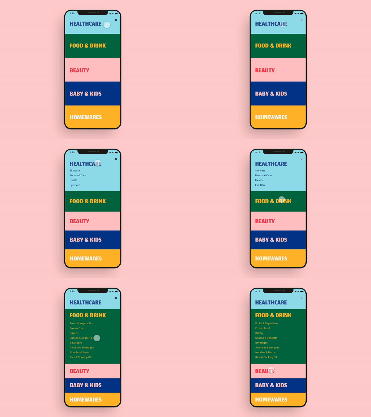
At its core, a Shared Element Transition is an animation that provides visual continuity as a user navigates between two screens. Imagine tapping on a product image in a list; instead of the new screen simply appearing, the tapped image smoothly animates—changing its size, position, and aspect ratio—to become the header image on the product detail screen. This effect creates a strong visual link between the two screens, making the navigation feel fluid and intuitive rather than disjointed.
This pattern is not new to mobile development, being a staple of native Android and iOS design, but implementing it in React Native has historically been a complex challenge. Reanimated 3 introduces a declarative and surprisingly simple API to achieve this, abstracting away the complex coordination required to animate elements across unmounting and mounting screens.
Key API: The sharedTransitionTag Prop
The magic behind shared transitions is orchestrated by a single, powerful prop: sharedTransitionTag. To link two components across different screens, you simply assign them the same string value for this prop. Reanimated’s engine uses this tag to identify the starting element on the old screen and the target element on the new screen, automatically calculating and running the transition between their respective layouts and styles.
Here’s a conceptual look at how it’s applied to an Animated component:
import Animated from 'react-native-reanimated';

// On the List Screen
<TouchableOpacity onPress={() => navigation.navigate('Detail', { itemId: item.id })}>
  <Animated.Image
    source={{ uri: item.imageUrl }}
    style={{ width: 100, height: 100 }}
    sharedTransitionTag={`item-image-${item.id}`}
  />
</TouchableOpacity>

// On the Detail Screen
<Animated.Image
  source={{ uri: item.imageUrl }}
  style={{ width: '100%', height: 300 }}
  sharedTransitionTag={`item-image-${item.id}`} // Same tag!
/>
By ensuring the tag is both unique to the element pair (e.g., by including an item ID) and identical on both screens, you provide Reanimated with all the information it needs to create the transition.
A Practical Guide to Implementing Shared Transitions
With the core concepts understood, let’s walk through a more complete, practical example. We’ll build a common pattern: a grid of photos that transition to a full-screen detail view upon selection. This example will use React Navigation News‘s popular stack navigator to manage the screens.
Setting Up the Environment

First, ensure you have the latest version of react-native-reanimated installed in your project:
npm install react-native-reanimated or yarn add react-native-reanimated
Next, you must add the Reanimated Babel plugin to your babel.config.js file. This step is critical as it transforms your code to enable the UI thread operations.
module.exports = { presets: [...], plugins: ['react-native-reanimated/plugin'], };
After updating the config, clear your bundler cache (npm start -- --reset-cache) and rebuild your app. This setup is standard for both vanilla React Native and Expo projects, reflecting the latest Vite News in build tooling trends towards simplification.
Building the List Screen
Our first screen will display a list of tappable items. Each item will contain an Animated.View or Animated.Image that we want to transition. The key is to wrap the component with a navigation link and assign the sharedTransitionTag.
import React from 'react';
import { View, FlatList, TouchableOpacity, StyleSheet, Text } from 'react-native';
import Animated from 'react-native-reanimated';
import { useNavigation } from '@react-navigation/native';

const ITEMS = [
  { id: '1', color: '#FF6347', title: 'Tomato' },
  { id: '2', color: '#4682B4', title: 'SteelBlue' },
  { id: '3', color: '#32CD32', title: 'LimeGreen' },
];

export function ListScreen() {
  const navigation = useNavigation();

  const renderItem = ({ item }) => (
    <TouchableOpacity
      style={styles.itemContainer}
      onPress={() => navigation.navigate('Detail', { item })}
    >
      <Animated.View
        style={[styles.box, { backgroundColor: item.color }]}
        sharedTransitionTag={`item-box-${item.id}`}
      />
      <Animated.Text
        style={styles.title}
        sharedTransitionTag={`item-title-${item.id}`}
      >
        {item.title}
      </Animated.Text>
    </TouchableOpacity>
  );

  return (
    <View style={styles.container}>
      <FlatList
        data={ITEMS}
        renderItem={renderItem}
        keyExtractor={(item) => item.id}
        numColumns={2}
      />
    </View>
  );
}

const styles = StyleSheet.create({
  container: { flex: 1, padding: 10, backgroundColor: '#fff' },
  itemContainer: { flex: 1, margin: 10, alignItems: 'center' },
  box: { width: 150, height: 150, borderRadius: 20 },
  title: { fontSize: 18, fontWeight: 'bold', marginTop: 8 },
});
In this example, we are transitioning both a colored box and a title, demonstrating that multiple elements can be shared simultaneously. Each gets its own unique tag based on the item’s ID.
Creating the Detail Screen
The detail screen will display the selected item in a different layout. We simply need to use Animated components again with the exact same sharedTransitionTag values passed via navigation parameters.
import React from 'react';
import { View, StyleSheet } from 'react-native';
import Animated from 'react-native-reanimated';
import { useRoute } from '@react-navigation/native';

export function DetailScreen() {
  const route = useRoute();
  const { item } = route.params;

  return (
    <View style={styles.container}>
      <Animated.View
        style={[styles.box, { backgroundColor: item.color }]}
        sharedTransitionTag={`item-box-${item.id}`}
      />
      <Animated.Text
        style={styles.title}
        sharedTransitionTag={`item-title-${item.id}`}
      >
        {item.title}
      </Animated.Text>
      <Animated.Text style={styles.description}>
        This is some detail text about the selected item. It fades in
        as the transition completes, creating a secondary animation.
      </Animated.Text>
    </View>
  );
}

const styles = StyleSheet.create({
  container: {
    flex: 1,
    alignItems: 'center',
    backgroundColor: '#fff',
    paddingTop: 50,
  },
  box: {
    width: '90%',
    height: 300,
    borderRadius: 20,
  },
  title: {
    fontSize: 32,
    fontWeight: 'bold',
    marginTop: 20,
  },
  description: {
    fontSize: 16,
    textAlign: 'center',
    paddingHorizontal: 20,
    marginTop: 15,
    color: 'gray',
  },
});
When you navigate between these two screens, Reanimated will automatically handle the interpolation of position, size, border radius, and even text size, creating a seamless and professional transition. This integration is a testament to the robust state of the React Native ecosystem, which includes powerful libraries for everything from UI components like React Native Paper News to state management with Zustand News.
Mastering Transitions: Advanced Customization
While the default transition is impressive, Reanimated 3 provides a rich API for customizing the animation to fit your app’s unique style. This is done by creating a custom transition object and applying it to your components.
Customizing the Animation with SharedTransition
The SharedTransition.custom() factory function allows you to define how the animation should behave. You can control the animation for width, height, originX, originY, and transform properties independently. This allows for incredibly granular control, enabling effects like a springy, bouncing transition.
Let’s create a custom spring-based transition:

import {
  SharedTransition,
  withSpring,
  withTiming,
  Easing,
} from 'react-native-reanimated';

// Create a custom transition with a springy effect for size and position
const customTransition = SharedTransition.custom((values) => {
  'worklet';
  return {
    height: withSpring(values.targetHeight, { damping: 15, stiffness: 100 }),
    width: withSpring(values.targetWidth, { damping: 15, stiffness: 100 }),
    originX: withTiming(values.targetOriginX, { duration: 350, easing: Easing.inOut(Easing.quad) }),
    originY: withTiming(values.targetOriginY, { duration: 350, easing: Easing.inOut(Easing.quad) }),
  };
});

// Then apply it to your Animated component
<Animated.View
  style={styles.box}
  sharedTransitionTag={`item-box-${item.id}`}
  sharedTransitionStyle={customTransition} // Apply the custom transition here
/>
In this example, the component’s width and height will animate using a spring physics model, giving it a playful bounce, while its position (originX, originY) will animate with a standard timing curve. This level of control is what sets libraries like Reanimated apart from simpler animation solutions, and it’s a topic often discussed alongside other animation libraries in React Spring News and Framer Motion News updates.
Combining with Layout Animations
Shared Transitions work beautifully with Reanimated’s other powerful features, such as Layout Animations. While the shared element is transitioning, other elements on the screen can also animate into place. For example, the description text on our detail screen can be made to fade in and slide up as the main transition completes.
You can achieve this by applying the entering and exiting props to the non-shared components.
import Animated, { FadeInUp, FadeOutDown } from 'react-native-reanimated';

// In the DetailScreen component
<Animated.Text
  style={styles.description}
  entering={FadeInUp.delay(200).duration(400)}
  exiting={FadeOutDown}
>
  This is some detail text...
</Animated.Text>
Here, the description text will wait 200ms (allowing the shared transition to start) and then fade in while sliding up. This orchestration of multiple animations creates a rich, choreographed user experience that feels highly polished.
Best Practices and Performance Considerations
To ensure your animations are always smooth and your app remains performant, it’s important to follow some best practices when implementing shared transitions.
Keep Transitioning Components Simple
The performance of a shared transition is related to the complexity of the component being animated. For best results, apply the sharedTransitionTag to fundamental components like Animated.View, Animated.Image, or –Animated.Text. Avoid applying it to deeply nested composite components, as this can increase the work Reanimated has to do to measure and animate the layout.

Ensure Tag Uniqueness
This cannot be overstated: the sharedTransitionTag must be unique for each element transitioning at a given time but identical for the source and destination pair. Using dynamic IDs from your data (e.g., `item-image-${item.id}`) is the most reliable way to ensure this. Duplicate tags can lead to unpredictable behavior or failed transitions.
Testing Your Animations
Animations, especially interactive ones, can be challenging to test. For critical user flows involving shared transitions, end-to-end testing tools are invaluable. The latest Detox News highlights its improving support for modern React Native features, making it a great choice for capturing screenshots or videos of your transitions to catch visual regressions in your CI/CD pipeline. Similarly, tools mentioned in Cypress News and Playwright News are leading the way for web-based React testing, and the principles carry over to mobile.
Memoize Screen Components
To prevent unnecessary re-renders that could interfere with the animation lifecycle, consider wrapping your screen components with React.memo. This is especially important on the list screen, where state updates unrelated to the list data could cause the entire list to re-render, potentially disrupting the animation’s starting measurements. This is a general React performance tip but is particularly relevant when dealing with complex animations and data fetching patterns, often managed by tools like React Query News or Apollo Client News.
Conclusion: The Future of React Native Animations
React Native Reanimated 3, with its introduction of Shared Element Transitions, represents a monumental leap forward for UI development in the ecosystem. What was once a complex, error-prone task is now accessible through a simple, declarative, and highly customizable API. By providing seamless visual continuity between screens, developers can now craft user experiences that are not only functional but truly delightful and engaging.
The key takeaways are clear: leverage the sharedTransitionTag to link elements, use the SharedTransition.custom() API for fine-grained control, and combine it with layout animations for a fully choreographed effect. As the React Native framework continues to mature with its New Architecture, libraries like Reanimated 3 will play a pivotal role in closing the gap with fully native development, empowering developers to build world-class applications with JavaScript. The next step is to experiment—pick a key navigation flow in your app and see how a shared transition can transform it from a simple screen change into a memorable interaction.


