
In the ever-evolving landscape of web and mobile development, the complexity of building, testing, and maintaining user interfaces has grown exponentially. Developers are constantly seeking tools that streamline this process, enforce consistency, and improve collaboration between designers and engineers. This is where Storybook has carved out an indispensable role. More than just a component gallery, Storybook has matured into a comprehensive workshop for UI development, acting as the central hub for building, testing, and documenting components in isolation. As the React ecosystem continues to flourish with updates in frameworks like Next.js and tools like Vite, keeping up with the latest Storybook News is crucial for any modern development team. This article dives deep into the current state of Storybook, exploring its core concepts, advanced integrations, and the best practices that will empower you to build more robust and maintainable UIs.
Understanding the Core Philosophy of Storybook
At its heart, Storybook is built on the principle of Component-Driven Development (CDD). This methodology encourages developers to build UIs from the “bottom up,” starting with individual components and progressively combining them to create complex pages and features. By developing components in isolation, you can focus on every possible state and variation without the noise and complexity of the full application context. This approach leads to more resilient, reusable, and easily testable UI elements.
What is a Story? The Building Block of Your UI
The fundamental unit in Storybook is the “story.” A story captures a single, rendered state of a UI component. For example, a Button component might have stories for its primary state, a secondary state, a disabled state, and a loading state. Each story is a simple JavaScript module that exports a default object containing metadata about the component and named exports for each specific state. The latest versions of Storybook champion the Component Story Format 3 (CSF 3), a more concise and object-oriented syntax.
Consider a simple Button component in a React project. Here’s how you would write its stories using CSF 3:
// src/components/Button.tsx
import React from 'react';

interface ButtonProps {
  label: string;
  primary?: boolean;
  size?: 'small' | 'medium' | 'large';
  onClick?: () => void;
}

export const Button = ({
  primary = false,
  size = 'medium',
  label,
  ...props
}: ButtonProps) => {
  const mode = primary ? 'storybook-button--primary' : 'storybook-button--secondary';
  return (
    <button
      type="button"
      className={['storybook-button', `storybook-button--${size}`, mode].join(' ')}
      {...props}
    >
      {label}
    </button>
  );
};

// src/stories/Button.stories.tsx
import type { Meta, StoryObj } from '@storybook/react';
import { Button } from '../components/Button';

// Metadata for the component
const meta: Meta<typeof Button> = {
  title: 'Example/Button',
  component: Button,
  tags: ['autodocs'], // Enables automatic documentation generation
  argTypes: {
    label: { control: 'text' },
    primary: { control: 'boolean' },
    size: { control: 'select', options: ['small', 'medium', 'large'] },
  },
};

export default meta;
type Story = StoryObj<typeof meta>;

// The "Primary" story
export const Primary: Story = {
  args: {
    primary: true,
    label: 'Button',
  },
};

// The "Secondary" story
export const Secondary: Story = {
  args: {
    label: 'Button',
  },
};

// The "Large" story
export const Large: Story = {
  args: {
    size: 'large',
    label: 'Button',
  },
};
Args: Powering Dynamic and Interactive Components
One of Storybook’s most powerful features is “Args.” Args are a dynamic way to define and manipulate the props of your components in real-time through the Storybook UI. As seen in the example above, the args object in each story sets the initial props. The argTypes metadata provides more granular control, allowing you to specify the type of UI control for each prop (e.g., a color picker for a color string, a dropdown for a set of options). This interactivity is not just for developers; it empowers designers, QA testers, and product managers to experiment with component variations without writing any code. This dynamic capability is a cornerstone of modern React News, as it facilitates faster iteration and better communication across teams.
Integrating Storybook into Your Development Workflow
Setting up Storybook in a modern frontend project has never been easier. Whether you’re using Create React App, or diving into the latest Next.js News or Vite News, the Storybook CLI handles most of the heavy lifting. The true power, however, comes from integrating it deeply into your testing and CI/CD pipelines.
Storybook component gallery
React components
Next.js interface
Vite interface – Naming components and hierarchy | Storybook docs
Setup and Configuration with Vite and Next.js
To add Storybook to an existing project, you simply run npx storybook@latest init. The CLI automatically detects your project’s framework (e.g., React, Vue, Angular) and installs the necessary dependencies and configuration files. For projects built with Vite, Storybook leverages its incredibly fast Hot Module Replacement (HMR) and build times, making the development experience exceptionally smooth. When working with Next.js, Storybook provides specific configurations to handle features like the next/image component and framework-specific routing, ensuring that components render correctly in isolation. This seamless integration is a key part of the latest Gatsby News and Remix News, as component libraries become more framework-agnostic.
Automated Testing with the Storybook Test Runner
While manual testing in the Storybook UI is valuable, automation is key to maintaining quality at scale. The @storybook/test-runner is a game-changer in this regard. It’s a standalone utility that leverages Jest and Playwright to run automated tests on all your stories. Out of the box, it performs a “smoke test” on every story to ensure it renders without errors. Its true potential is unlocked with the play function, which allows you to script user interactions directly within your story file using APIs from React Testing Library News and Jest’s expect.
Here’s an example of a story for a login form that includes an interaction test:
// src/stories/LoginForm.stories.tsx
import type { Meta, StoryObj } from '@storybook/react';
import { within, userEvent, expect } from '@storybook/test';
import { LoginForm } from '../components/LoginForm';

const meta: Meta<typeof LoginForm> = {
  title: 'Forms/LoginForm',
  component: LoginForm,
};

export default meta;
type Story = StoryObj<typeof meta>;

export const EmptyForm: Story = {};

export const FilledForm: Story = {
  play: async ({ canvasElement }) => {
    const canvas = within(canvasElement);

    // Find the elements to interact with
    const emailInput = canvas.getByLabelText('Email', { selector: 'input' });
    const passwordInput = canvas.getByLabelText('Password', { selector: 'input' });
    const submitButton = canvas.getByRole('button', { name: /log in/i });

    // Simulate user typing
    await userEvent.type(emailInput, 'test@example.com', { delay: 100 });
    await userEvent.type(passwordInput, 'a-secure-password', { delay: 100 });

    // Simulate user click
    await userEvent.click(submitButton);

    // Add assertions to verify the outcome
    // For example, you might check for a success message or a loading spinner
    // For this example, we'll just check if the inputs have the correct values
    await expect(emailInput).toHaveValue('test@example.com');
    await expect(passwordInput).toHaveValue('a-secure-password');
  },
};
When you run the test runner, it will open a browser, render the FilledForm story, execute the steps in the play function, and report any failures. This bridges the gap between component development and end-to-end testing tools like Cypress News or Playwright News, ensuring your components are functionally correct from the start.
Beyond the Basics: Advanced Storybook Techniques
As your application and component library grow, you’ll encounter more complex scenarios involving global state, data fetching, and the need for pixel-perfect visual consistency. Storybook provides advanced features to handle these challenges gracefully.
Handling Data and State Management with Decorators
Components rarely live in a true vacuum. They often depend on context providers for theming, routing, or global state. The latest Redux News and trends in state management with libraries like Zustand News, Recoil News, and Jotai News highlight the importance of this. Storybook’s “decorators” are higher-order components that wrap your stories, providing this necessary context. You can apply decorators globally, at the component level, or to individual stories.
For instance, if your components rely on a data-fetching library like React Query or Apollo Client, you can create a decorator to provide a mock client. This allows your components to render as if they have fetched real data.

Storybook component gallery
React components
Next.js interface
Vite interface – Manage Your React Components Efficiently with Storybook – Apiumhub …
// .storybook/preview.tsx
import React from 'react';
import type { Preview } from '@storybook/react';
import { QueryClient, QueryClientProvider } from '@tanstack/react-query';

// Create a client
const queryClient = new QueryClient();

export const decorators = [
  (Story) => (
    <QueryClientProvider client={queryClient}>
      <Story />
    </QueryClientProvider>
  ),
];

const preview: Preview = {
  parameters: {
    // ... other parameters
  },
  decorators, // Apply decorators globally
};

export default preview;
This same pattern applies to theming providers, internationalization (i18n) libraries, and routers like React Router News. By using decorators, you ensure your components are previewed and tested in an environment that closely mirrors your production application.
Storybook for React Native: A Unified Component Library
The principles of component-driven development are just as relevant in the mobile world. The latest React Native News and Expo News show a growing emphasis on creating cross-platform design systems. Storybook for React Native allows you to run your Storybook instance directly on a device or simulator. This enables you to develop and test UI components from libraries like React Native Paper News, NativeBase News, or Tamagui News in a completely isolated environment, accelerating your mobile development workflow and ensuring visual consistency between your web and mobile applications.
Best Practices for a Maintainable Storybook
To get the most out of Storybook, it’s essential to follow best practices that keep your component library organized, performant, and easy to navigate.
Organizing Your Stories and Documentation
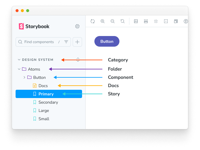
A well-organized Storybook is a pleasure to use. Co-locating your story files with your component files (e.g., Button.tsx and Button.stories.tsx in the same folder) makes them easy to find and maintain. Use the title property in your story’s metadata to create a logical hierarchy in the sidebar, grouping related components under categories like “Forms,” “Navigation,” or “Layout.”
For more comprehensive documentation, Storybook supports MDX (Markdown with JSX). MDX allows you to write long-form documentation, usage guidelines, and even embed live, interactive stories directly within your markdown files. This transforms your Storybook from a component gallery into a full-fledged design system documentation site.
{/* src/stories/Introduction.mdx */}
import { Meta } from '@storybook/blocks';

<Meta title="Introduction" />

# Welcome to Our Design System

This is our central source of truth for UI components, standards, and guidelines.

## Principles

- **Accessible**: Components must meet WCAG 2.1 AA standards.
- **Responsive**: Components should adapt to all screen sizes.
- **Performant**: Components must be optimized for fast loading and interaction.

Here is an example of our primary button:

import { Canvas, Story } from '@storybook/blocks';
import * as ButtonStories from './Button.stories';

<Canvas>
  <Story of={ButtonStories.Primary} />
</Canvas>
Optimizing Performance
As your Storybook grows, build and startup times can become a concern. Recent versions have introduced significant performance improvements, including lazy compilation, which only builds the stories you are currently viewing. Leveraging modern bundlers like Vite also provides a significant boost. Keep your dependencies clean and ensure you are not importing large, unnecessary libraries into your stories to maintain a snappy development experience.
Conclusion: The Future is Component-Driven
Storybook has firmly established itself as an essential tool in the modern frontend developer’s toolkit. It has evolved far beyond a simple UI viewer into a powerful workshop for developing, testing, and documenting components in isolation. By embracing its core features like CSF and Args, integrating it with automated testing, and leveraging advanced techniques like decorators and MDX, you can significantly improve your team’s workflow, code quality, and collaboration. The latest Storybook News shows a clear trajectory towards deeper integration with the entire development lifecycle, from design handoff to automated visual regression testing and accessibility audits. As the complexity of UIs continues to grow, a component-driven approach with Storybook at its center is no longer a luxury—it’s a necessity for building scalable and maintainable applications.