In the ever-evolving landscape of mobile app development, creating a beautiful, consistent, and performant user interface is paramount. For developers in the React Native ecosystem, the challenge often lies in finding a component library that balances ease of use with deep customization. This is where NativeBase shines. As a universal component library, NativeBase empowers developers to build stunning UIs for Android, iOS, and the web with a single, consistent API. It leverages a utility-first approach, similar to Tailwind CSS, allowing for rapid prototyping and highly granular style control without sacrificing maintainability.
This article provides a comprehensive guide to leveraging the full potential of NativeBase in your React Native projects. We will move beyond a simple “Hello World” and construct a practical, tab-based application from the ground up. We’ll explore core concepts, dive into the implementation of navigation, build out complex screens with sophisticated components, and cover advanced techniques like theming and optimization. Whether you’re a seasoned developer keeping up with the latest React Native News or a newcomer exploring the rich ecosystem of tools like Expo News, this guide will equip you with the knowledge to build professional-grade mobile applications efficiently.
Understanding the Core Concepts of NativeBase
Before we start building, it’s crucial to grasp the fundamental principles that make NativeBase a powerful choice. Unlike some component libraries that offer pre-styled, rigid components, NativeBase provides a set of highly composable and customizable building blocks designed for flexibility and developer experience.
The Utility-First Philosophy
At its heart, NativeBase adopts a utility-first CSS philosophy. Instead of writing custom style objects, you apply utility props directly to components. This approach significantly speeds up development by keeping your styling logic colocated with your component markup. It also encourages consistency by drawing from a predefined design system (your theme), reducing the chances of “magic numbers” or one-off style values cluttering your codebase.
Consider a simple card layout. Instead of this:
import { StyleSheet, View, Text } from 'react-native';

const Card = ({ title, children }) => (
  <View style={styles.card}>
    <Text style={styles.title}>{title}</Text>
    <View>{children}</View>
  </View>
);

const styles = StyleSheet.create({
  card: {
    backgroundColor: 'white',
    borderRadius: 8,
    padding: 16,
    margin: 12,
    shadowColor: '#000',
    shadowOffset: { width: 0, height: 2 },
    shadowOpacity: 0.1,
    shadowRadius: 4,
    elevation: 3,
  },
  title: {
    fontSize: 18,
    fontWeight: 'bold',
    marginBottom: 8,
  },
});
With NativeBase, you can achieve the same result declaratively:
import { Box, Heading, Text } from 'native-base';

const Card = ({ title, children }) => (
  <Box
    bg="white"
    borderRadius="lg"
    p="4"
    m="3"
    shadow="3"
    _dark={{ bg: 'coolGray.800' }}
  >
    <Heading size="md" mb="2">
      {title}
    </Heading>
    <Text>{children}</Text>
  </Box>
);
Notice the props like bg (background), borderRadius, p (padding), m (margin), and shadow. These map directly to theme values, ensuring consistency. The _dark prop also demonstrates built-in support for color modes, a critical feature for modern applications.
Setup and Integration
Getting started with NativeBase is straightforward, especially within an Expo or React Native CLI project. After initializing your project, you’ll install native-base and its peer dependencies.
The key to making it all work is the NativeBaseProvider. This component must wrap your entire application, typically in your root file (App.js or App.tsx). It uses React’s Context API to provide the theme, color mode, and other essential configurations to all descendant components.
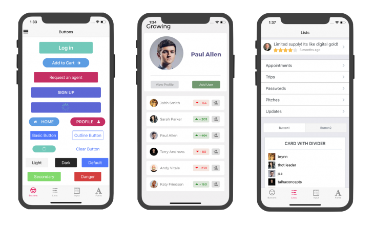
Implementing a Tab-Based Navigation Structure
Most modern mobile apps rely on a robust navigation system. A common pattern is bottom tab navigation. For this, we’ll use React Navigation, the de facto standard for routing and navigation in React Native. The latest React Navigation News highlights its improved performance and type-safety with TypeScript.
Setting Up React Navigation
First, install the necessary React Navigation packages:
# Install core utilities
npm install @react-navigation/native

# Install dependencies for a native stack navigator
npx expo install react-native-screens react-native-safe-area-context

# Install the bottom tabs navigator
npm install @react-navigation/bottom-tabs
Integrating NativeBase with the Tab Bar
Once React Navigation is set up, we can create a tab navigator and customize its appearance using NativeBase components. This allows us to create a tab bar that perfectly matches our app’s theme and design system, rather than relying on the default platform styles.
In this example, we’ll create a simple tab navigator with two screens: “Home” and “Settings”. We’ll use NativeBase’s Icon component (which leverages icon sets like FontAwesome or Ionicons) to display custom icons.
import React from 'react';
import { NavigationContainer } from '@react-navigation/native';
import { createBottomTabNavigator } from '@react-navigation/bottom-tabs';
import { NativeBaseProvider, Box, Text, Icon, Center } from 'native-base';
import { Ionicons } from '@expo/vector-icons';

// Dummy screens
const HomeScreen = () => (
  <Center flex={1}>
    <Text fontSize="xl">Home Screen</Text>
  </Center>
);
const SettingsScreen = () => (
  <Center flex={1}>
    <Text fontSize="xl">Settings Screen</Text>
  </Center>
);

const Tab = createBottomTabNavigator();

function MyTabs() {
  return (
    <Tab.Navigator
      screenOptions={({ route }) => ({
        headerShown: false, // Hide the default header
        tabBarIcon: ({ focused, color, size }) => {
          let iconName;
          if (route.name === 'Home') {
            iconName = focused ? 'home' : 'home-outline';
          } else if (route.name === 'Settings') {
            iconName = focused ? 'settings' : 'settings-outline';
          }
          // We use NativeBase's Icon component here
          return <Icon as={Ionicons} name={iconName} size={size} color={color} />;
        },
        tabBarActiveTintColor: 'tomato',
        tabBarInactiveTintColor: 'gray',
        tabBarStyle: { backgroundColor: '#fff' }, // Or use theme colors
      })}
    >
      <Tab.Screen name="Home" component={HomeScreen} />
      <Tab.Screen name="Settings" component={SettingsScreen} />
    </Tab.Navigator>
  );
}

export default function App() {
  return (
    <NativeBaseProvider>
      <NavigationContainer>
        <MyTabs />
      </NavigationContainer>
    </NativeBaseProvider>
  );
}
This setup provides a solid foundation. By controlling the tabBarIcon render prop, we can insert any NativeBase component, allowing for complex layouts, badges, or custom animations, perhaps using libraries like React Native Reanimated News is tracking.
Building a Complex Screen: A News Feed Example
With our navigation in place, let’s build a more realistic screen. A news feed or a list of items is a common requirement. This is where we can showcase more of NativeBase’s layout and data display components, such as VStack, HStack, FlatList, and Image.
Fetching and Displaying Data
For data fetching, the community is rapidly moving towards libraries like React Query or Apollo Client. The latest React Query News and Apollo Client News both emphasize their powerful caching, synchronization, and state management capabilities, which greatly simplify data handling. For this example, we’ll use mock data, but you can easily swap it out with a real API call managed by one of these libraries.
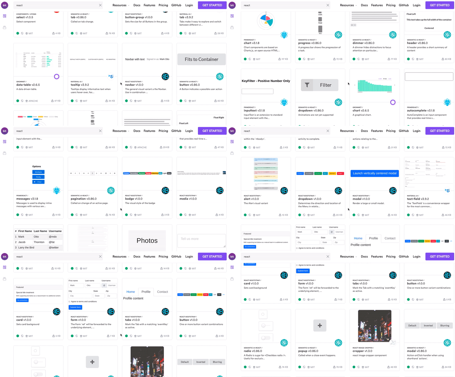
We’ll create a NewsCard component and display a list of them using NativeBase’s FlatList, which is a wrapper around the standard React Native component with added utility props.
import React from 'react';
import {
  Box,
  FlatList,
  Image,
  Text,
  VStack,
  HStack,
  Heading,
  Spacer,
  AspectRatio,
} from 'native-base';

const mockData = [
  {
    id: '1',
    title: 'React Native News: The Future of Cross-Platform',
    timestamp: '12 hours ago',
    source: 'TechCrunch',
    imageUrl: 'https://via.placeholder.com/150?text=React',
  },
  {
    id: '2',
    title: 'Expo News: EAS Build Now Generally Available',
    timestamp: '1 day ago',
    source: 'Expo Blog',
    imageUrl: 'https://via.placeholder.com/150?text=Expo',
  },
  {
    id: '3',
    title: 'Zustand News: Simplifying State Management',
    timestamp: '2 days ago',
    source: 'Dev.to',
    imageUrl: 'https://via.placeholder.com/150?text=State',
  },
];

const NewsCard = ({ item }) => (
  <Box
    borderBottomWidth="1"
    _dark={{ borderColor: 'muted.50' }}
    borderColor="muted.300"
    pl={['0', '4']}
    pr={['0', '5']}
    py="4"
  >
    <HStack space={[2, 3]} justifyContent="space-between">
      <AspectRatio w="20%" ratio={1}>
        <Image
          source={{ uri: item.imageUrl }}
          alt="image"
          borderRadius="md"
        />
      </AspectRatio>
      <VStack w="75%">
        <Text
          _dark={{ color: 'warmGray.50' }}
          color="coolGray.800"
          bold
        >
          {item.title}
        </Text>
        <Text color="coolGray.600" _dark={{ color: 'warmGray.200' }}>
          {item.source}
        </Text>
      </VStack>
      <Spacer />
      <Text fontSize="xs" color="coolGray.800" _dark={{ color: 'warmGray.50' }} alignSelf="flex-start">
        {item.timestamp}
      </Text>
    </HStack>
  </Box>
);

const NewsFeedScreen = () => {
  return (
    <Box flex={1} safeAreaTop>
      <Heading p="4" pb="3" size="lg">
        Latest News
      </Heading>
      <FlatList
        data={mockData}
        renderItem={({ item }) => <NewsCard item={item} />}
        keyExtractor={(item) => item.id}
      />
    </Box>
  );
};

// This screen would then be used in your Tab Navigator
// <Tab.Screen name="Home" component={NewsFeedScreen} />
This example demonstrates the power of composition. We use HStack for horizontal arrangement and VStack for vertical stacks. Spacer pushes elements apart, and utility props like pl (padding-left) and py (padding-vertical) allow for precise, responsive spacing. This approach is far more readable and maintainable than complex stylesheet objects. While we used mock data, integrating a state management solution like Redux News or a lighter alternative like Zustand News or Recoil News would be the next logical step for a real-world application.
Advanced Techniques, Best Practices, and Optimization
To build truly professional applications, you need to go beyond the basics. This involves custom theming, ensuring performance, and writing maintainable code.
Deep Theming and Customization
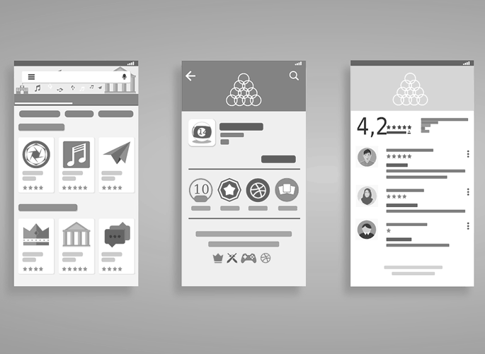
NativeBase’s biggest strength is its extensive theming capability. You can override almost everything, from colors and fonts to component variants. By extending the default theme, you create a centralized design system for your app.
Create a custom theme file and pass it to the NativeBaseProvider.
import { extendTheme } from 'native-base';

const customTheme = extendTheme({
  colors: {
    primary: {
      50: '#E3F2F9',
      100: '#C5E4F3',
      // ... up to 900
      500: '#0B74DE',
      600: '#005DB4',
    },
    amber: {
      400: '#facc15',
    },
  },
  components: {
    Button: {
      // Define a custom variant
      variants: {
        'primary-solid': ({
          colorScheme
        }) => {
          return {
            bg: `${colorScheme}.500`,
            _hover: {
              bg: `${colorScheme}.600`
            },
            _pressed: {
              bg: `${colorScheme}.700`
            },
          };
        },
      },
      // Set default props
      defaultProps: {
        colorScheme: 'primary',
        variant: 'primary-solid',
      },
    },
  },
  config: {
    // Changing initial color mode
    initialColorMode: 'dark',
  },
});

// In your App.js
// <NativeBaseProvider theme={customTheme}>
//  ... your app
// </NativeBaseProvider>
With this theme, any <Button> component will now default to your custom primary variant. This enforces consistency and dramatically reduces code duplication. This level of design system control is also a focus in competing libraries, as seen in the latest React Native Paper News and Tamagui News.
Performance and Optimization
- Memoize Components: For complex list items in a
FlatList, wrap them inReact.memoto prevent unnecessary re-renders. - Use Specific Components: Prefer
VStackandHStackoverBoxwith flex props, as they are optimized for those layouts. - Avoid Inline Functions: For props like
onPressin lists, define the function outside the render method to prevent creating a new function on every render. - Testing is Key: Implement a robust testing strategy. For unit and integration tests, Jest News and React Testing Library News are the standards. For end-to-end testing on a real device or simulator, Detox News is a powerful framework specifically for React Native.
Comparing with Other Frameworks
While this article focuses on React Native, it’s worth noting the broader React ecosystem. Web frameworks like Next.js News, Remix News, and Gatsby News have popularized concepts like server-side rendering and static site generation. NativeBase’s web support means you can share components and theming logic between your mobile app and a web counterpart built with these tools, leading to a more unified development experience.
Conclusion: Your Next Steps with NativeBase
We’ve journeyed from the foundational, utility-first principles of NativeBase to building a functional, tab-based application with complex screens and a custom theme. We’ve seen how NativeBase, combined with the power of React Navigation and the broader React ecosystem, provides a formidable stack for building high-quality, cross-platform mobile applications.
The key takeaway is that NativeBase is more than just a component library; it’s a design system toolkit. By embracing its utility-first props, composable components, and deep theming capabilities, you can accelerate your development workflow, enforce UI consistency, and build beautiful, performant apps for iOS, Android, and the web. Your next step is to dive into the official documentation, experiment with more complex components like Modal, ActionSheet, and forms (using libraries like React Hook Form News), and start building your own design system. The mobile development world moves fast, but with powerful tools like NativeBase, you’re well-equipped to keep pace and build the next generation of applications.
