The Evolution of UI Development: Why Storybook Remains Essential
In the fast-paced world of frontend development, the tools we use are constantly evolving. Frameworks like React, Vue, and Svelte have revolutionized how we build user interfaces, but managing the complexity of a growing component library remains a significant challenge. This is where Storybook shines. More than just a component gallery, Storybook is an open-source workshop for building, testing, and documenting UI components in isolation. As projects scale, it becomes an indispensable tool for maintaining consistency, improving collaboration between developers and designers, and accelerating the development lifecycle. The latest Storybook News reveals a tool that is more powerful, faster, and more integrated into the modern development workflow than ever before.
From its integration with fast build tools like Vite, which brings near-instant hot module replacement, to its advanced testing capabilities that blur the line between development and QA, Storybook has solidified its place as a cornerstone of modern frontend architecture. This article provides a comprehensive deep dive into the latest features, advanced techniques, and best practices for leveraging Storybook in your projects. We’ll explore the nuances of writing stories with modern syntax, setting up robust interaction tests, generating comprehensive documentation, and optimizing your workflow for maximum efficiency. Whether you’re working with Next.js News, building a design system for a React Native app, or simply looking to streamline your component development, understanding modern Storybook is key to building durable, high-quality user interfaces.
Section 1: Core Concepts and Modern Story Syntax
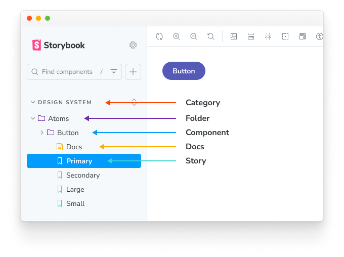
At its heart, Storybook is about writing “stories.” A story captures a rendered state of a UI component. Historically, there have been several ways to write stories, but the ecosystem has now standardized around the Component Story Format (CSF), with CSF 3.0 being the latest iteration. This format is more ergonomic, portable, and powerful, enabling features like automatic argument inference and play functions.
Default vs. Named Exports in CSF
One of the most significant shifts in modern Storybook is the move towards named exports for defining individual stories. While the default export is still required for component metadata (like the component itself, title, and `argTypes`), named exports provide a cleaner and more scalable way to define multiple states of a single component in one file.
Let’s look at a practical example for a `Button` component:
// src/components/Button.stories.jsx
import { Button } from './Button';

// Default export: Provides metadata for the component stories
export default {
  title: 'Components/Button',
  component: Button,
  // argTypes defines the controls for your component's props
  argTypes: {
    backgroundColor: { control: 'color' },
    size: {
      control: { type: 'select' },
      options: ['small', 'medium', 'large'],
    },
    onClick: { action: 'clicked' }, // Integrates with the Actions addon
  },
};

// Named export: Defines a specific story (a component state)
// This is the "Primary" variant of our button.
export const Primary = {
  args: {
    primary: true,
    label: 'Button',
    size: 'medium',
  },
};

// Another named export for the "Secondary" variant
export const Secondary = {
  args: {
    label: 'Button',
    size: 'medium',
  },
};

// A "Large" variant story
export const Large = {
  args: {
    ...Primary.args, // Reuse args from another story
    size: 'large',
    label: 'Large Button',
  },
};
In this example, the `default` export sets up the story’s location in the Storybook UI (“Components/Button”) and configures the interactive controls (`argTypes`). Each `named` export (`Primary`, `Secondary`, `Large`) then defines a specific instance of the `Button` with its own set of arguments (`args`). This approach is highly modular and allows for easy composition and reuse of arguments between stories, a significant improvement over older formats.
Section 2: Interactive Development with Addons
Storybook’s true power is unlocked through its extensive addon ecosystem. These addons provide functionality for everything from interactive controls and event logging to accessibility auditing and design validation. Let’s focus on three essential addons that every developer should master.
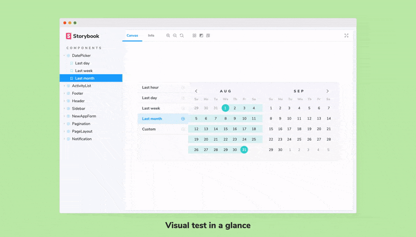
Controls: Dynamic Prop Manipulation
React components
UI components
Storybook interface
Storybook component gallery – Naming components and hierarchy | Storybook docs
The Controls addon reads the `argTypes` defined in your story’s default export and automatically generates a UI that allows you to edit a component’s props in real-time. This creates a powerful playground for testing edge cases and seeing how a component behaves with different data, without ever leaving the browser. The previous code example already set up `argTypes` for `backgroundColor`, `size`, and `onClick`. Storybook will use this metadata to render a color picker, a select dropdown, and an action logger, respectively.
Actions: Logging Events and Callbacks
How do you verify that a button’s `onClick` handler is actually being called? The Actions addon provides the answer. By defining an `action` for a specific prop in `argTypes`, you tell Storybook to log any calls to that function in the “Actions” panel. This is invaluable for debugging components that rely on event handlers and callbacks.
Here’s how you might write a story for a simple form component to demonstrate this:
// src/components/LoginForm.stories.jsx
import { LoginForm } from './LoginForm';

export default {
  title: 'Components/LoginForm',
  component: LoginForm,
  argTypes: {
    // We want to log the data passed to the onSubmit function
    onSubmit: { action: 'submitted' },
  },
};

export const Default = {
  args: {
    // Initial props for the form
  },
};
When a user interacts with the `LoginForm` in the Storybook UI and triggers the `onSubmit` event, the “Actions” tab will display the event details, including the arguments passed to the function (e.g., `{ email: ‘[email protected]’, password: ‘password’ }`). This immediate feedback loop is crucial for rapid development and is a key topic in React Hook Form News and Formik News, as it integrates seamlessly with popular form libraries.
Docs: Automated and Custom Documentation
Good documentation is the backbone of any successful design system or component library. The Docs addon automatically generates a documentation page for each component, including a props table (inferred from `argTypes` or TypeScript types), source code snippets, and interactive story canvases. For more detailed documentation, you can use MDX (Markdown with JSX) to write rich, long-form content that combines text with live, interactive components.
{/* Button.mdx */}
import { Meta, Story, Canvas } from '@storybook/addon-docs';
import * as stories from './Button.stories';

<Meta of={stories} />

# Button Component

This is our primary button component, used for all main calls-to-action.

It supports several variants, sizes, and color options.

## Primary Button
The primary button should be used for the most important action on a page.

<Canvas>
  <Story of={stories.Primary} />
</Canvas>

## Secondary Button
The secondary button is for less important actions.

<Canvas>
  <Story of={stories.Secondary} />
</Canvas>
This MDX file creates a beautiful documentation page that not only explains how to use the `Button` but also embeds the interactive stories directly within the content.
Section 3: Advanced Techniques: From Testing to Composition
Modern Storybook goes far beyond simple component visualization. It has evolved into a powerful hub for automated testing, enabling you to catch bugs earlier and ensure your UI is robust and accessible.
Interaction Testing with the `play` Function
One of the most groundbreaking features in recent Storybook versions is the `play` function. This function, attached to a story, contains a script that simulates user interactions after the component has rendered. It uses familiar APIs from libraries like Testing Library and Jest, making it easy to write tests that verify component behavior.
Let’s expand our `LoginForm` story with an interaction test:
// src/components/LoginForm.stories.jsx
import { userEvent, within } from '@storybook/testing-library';
import { expect } from '@storybook/jest';
import { LoginForm } from './LoginForm';

export default {
  title: 'Components/LoginForm',
  component: LoginForm,
  argTypes: { onSubmit: { action: 'submitted' } },
};

export const Default = {};

// A story to test form submission with valid input
export const SubmittingForm = {
  play: async ({ canvasElement, args }) => {
    // Get a reference to the component's DOM
    const canvas = within(canvasElement);

    // Simulate user typing into the email and password fields
    await userEvent.type(canvas.getByLabelText(/email/i), '[email protected]');
    await userEvent.type(canvas.getByLabelText(/password/i), 'a-secure-password');

    // Simulate clicking the submit button
    await userEvent.click(canvas.getByRole('button', { name: /log in/i }));

    // Assert that the onSubmit function was called with the correct data
    await expect(args.onSubmit).toHaveBeenCalledWith({
      email: '[email protected]',
      password: 'a-secure-password',
    });
  },
};
This `play` function automates the process of filling out and submitting the form. When you view this story, Storybook executes these steps and provides a visual step-by-step debugger. Furthermore, you can use the `@storybook/test-runner` package to run these interactions in a headless browser as part of your CI/CD pipeline. This effectively turns every story into an end-to-end test, a major development discussed in React Testing Library News, Jest News, and Cypress News circles.
Accessibility (A11y) Auditing
Building accessible applications is a non-negotiable requirement. The Storybook A11y addon integrates the Deque Axe-core engine directly into your development environment. It adds a new “Accessibility” panel that automatically runs audits on the rendered component and highlights any violations, such as missing alt text, insufficient color contrast, or improper ARIA attributes. This immediate feedback helps developers catch and fix accessibility issues long before they reach production.
Section 4: Best Practices and Performance Optimization
To get the most out of Storybook, it’s essential to follow best practices for organization, configuration, and performance.
Structuring Your Stories
For maintainability, it’s highly recommended to co-locate your story files with your component files. A typical structure would look like this:

src/
└── components/
    └── Button/
        ├── Button.jsx
        ├── Button.css
        ├── Button.test.jsx
        └── Button.stories.jsx
This keeps all related files together, making it easier to navigate the codebase and update stories whenever the component changes.
Optimizing for Performance with Vite
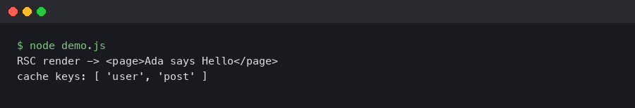
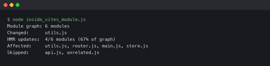
As a project grows, Storybook’s startup and rebuild times can become a bottleneck. The latest Vite News highlights its incredible speed, and integrating it with Storybook is a game-changer. By using the `@storybook/builder-vite` package, you can replace the default Webpack builder with Vite. This results in significantly faster server start times and near-instant Hot Module Replacement (HMR), dramatically improving the developer experience, especially in large codebases common in projects built with frameworks discussed in Remix News or Gatsby News.
Tips and Considerations
- State Management: When writing stories for components connected to a global state manager (like Redux or Zustand), use decorators to provide a mock store or context. This keeps your stories isolated and focused on the component itself. This is a recurring topic in Redux News and Zustand News.
- Component-Driven Development (CDD): Embrace the CDD methodology. Build and test your components in Storybook first, before integrating them into your main application. This approach promotes reusability and leads to a more robust and modular architecture.
- React Native Integration: The principles discussed here apply equally to mobile development. The latest React Native News and Expo News show a growing ecosystem around Storybook for React Native, allowing you to build and test mobile components in isolation on a web canvas or directly on a device. Libraries like Tamagui News are also pushing the boundaries of cross-platform UI development with Storybook integration.
Conclusion: The Future of UI Development is Isolated and Testable
Storybook has evolved far beyond its origins as a simple component viewer. It is now a comprehensive workshop for the entire UI development lifecycle—from initial design and development to automated testing and documentation. By embracing modern features like Component Story Format 3.0, the `play` function for interaction testing, and performance enhancements from builders like Vite, development teams can create more resilient, consistent, and well-documented design systems.
The key takeaways are clear: write your components in isolation, leverage addons to create an interactive development environment, and automate your testing by turning stories into verifiable user flows. As the frontend ecosystem continues to mature, tools like Storybook that promote modularity, collaboration, and quality will only become more critical. The next step is to integrate these practices into your own workflow—start by auditing your existing stories, migrating to the latest CSF syntax, and introducing interaction tests for your most critical components. The investment will pay dividends in code quality and development speed.


